Mickey Rafa
  • Home
  • Portfolio
  • Workshops
  • Visualizations
Categories
All (15)
#MakeoverMonday (3)
#TidyTuesday (12)
R (15)
area-plot (1)
bar-plot (3)
bubble-chart (1)
bump-chart (1)
connected-dot-plot (1)
gt (3)
histogram (1)
jitter-plot (1)
line-plot (5)
nlp (1)
ribbon-plot (1)
ridge-plot (1)
scatter-plot (1)
small-multiples (1)
ternary-plot (1)
tile-map (1)

Visualizations

Visualizing the prevalence and occurence of modern slavery globally
R
#MakeoverMonday
gt
bubble-chart
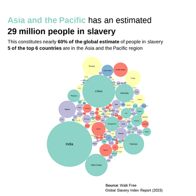
Remaking a table from the Global Slavery Index Report (2023) by Walk Free
Mickey Rafa
Dec 12, 2024

Analyzing relative password strength
R
#TidyTuesday
jitter-plot
Using a jitterplot to show the relative distribution of categories
Mickey Rafa
Dec 30, 2022

Visualizing Big 12 Basketball program performance
R
#TidyTuesday
area-plot
small-multiples
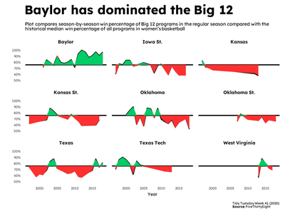
Which teams have reigned supreme?
Mickey Rafa
Dec 30, 2022

U.S. National Parks Visits (1904-2016)
R
#TidyTuesday
bump-chart
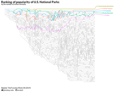
Evaluating changes in the popularity of U.S. National Parks over time
Mickey Rafa
Dec 30, 2022

Visualizing agricultural data using conditionally formatted tables
R
#TidyTuesday
gt
Using the {gt} package to visualize data in tables
Mickey Rafa
Dec 30, 2022

Visualizing Pell Grant Awards in the U.S. in 2017
R
#TidyTuesday
line-plot
gt
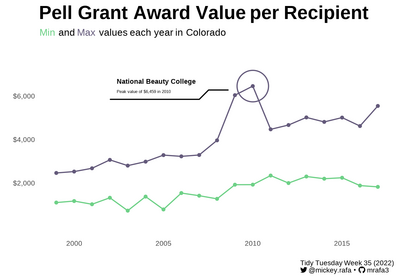
Exploring Colorado trends and the overall state-level Pell grant distribution
Mickey Rafa
Dec 30, 2022

Visualizing enrollment in HBCUs by gender over time
R
#TidyTuesday
line-plot
ribbon-plot
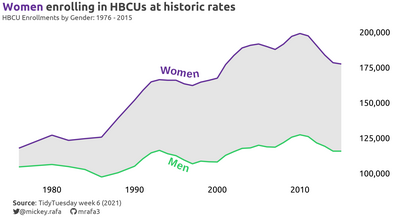
Women far outnumber men at HBCUs
Mickey Rafa
Dec 21, 2022

Visualizing the expansion of wind turbine projects in Canada over time
R
#TidyTuesday
line-plot
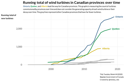
Showing the major expansion in wind projects in Canada in the 2010s
Mickey Rafa
Oct 29, 2020

Visualizing Anscombe’s Quartet
R
#TidyTuesday
scatter-plot
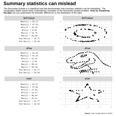
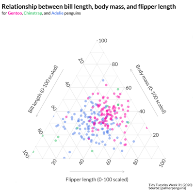
Different shapes can have similar summary statistics
Mickey Rafa
Oct 16, 2020

Visualizing responses to an analytics strategy survey
R
#MakeoverMonday
bar-plot
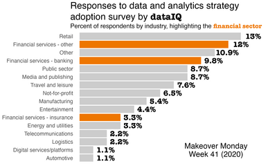
Refreshing a style-forward graphic to improve understanding
Mickey Rafa
Oct 14, 2020

Visualizing child marriage globally
R
#MakeoverMonday
bar-plot
connected-dot-plot
tile-map
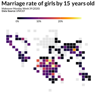
Making over a dashboard with a series of plots that tell the story of child marriage
Mickey Rafa
Oct 12, 2020

How do Beyonce and Taylor Swift lyrics differ?
R
#TidyTuesday
bar-plot
nlp
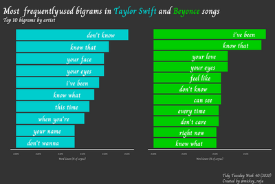
Using {tidytext} to process and visualize word pairs in song lyrics
Mickey Rafa
Oct 4, 2020

Analyzing size distributions in the Palmer Penguins dataset
R
#TidyTuesday
ternary-plot
ridge-plot
Visualizing distributions with some alternative chart types
Mickey Rafa
Sep 25, 2020

Visualizing Australian climate data over time
R
#TidyTuesday
line-plot
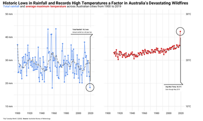
Putting Australia’s extreme climate conditions in 2019 into historical context
Mickey Rafa
Sep 23, 2020

Visualizing the Himalayas and expeditions over time
R
#TidyTuesday
histogram
line-plot
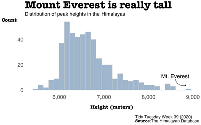
Using data from the Himalayan Database to put the scope and expedition activity into perspective
Mickey Rafa
Sep 22, 2020
No matching items