---
title: "Visualizing child marriage globally"
description: "Making over a dashboard with a series of plots that tell the story of child marriage"
author:
- name: Mickey Rafa
url: https://mrafa3.github.io/
date: 10-12-2020
categories: [R, "#MakeoverMonday", bar-plot, connected-dot-plot, tile-map] # self-defined categories
image: "mm_2020_39_tilemap_thumbnail.png"
draft: false # setting this to `true` will prevent your post from appearing on your listing page until you're ready!
format:
html:
toc: true
toc-depth: 5
code-link: true
code-fold: true
code-tools: true
code-summary: "Show code"
self-contained: true
editor_options:
chunk_output_type: inline
execute:
error: false
message: false
warning: false
eval: true
---
Every year, millions of children – mostly young girls – have their futures decided for them through child marriage. This isn't just about numbers in a dataset; it's about real kids losing their chance to grow, dream, and choose their own paths. While there has been progress, child marriage still happens too often, driven by from poverty and gender power dynamics in societies. Before I worked on this #MakeoverMonday, I wanted to recognize the humanity and pain in this data.
Here's some more information from [UNICEF's website](https://www.unicef.org/protection/child-marriage):
> Child marriage refers to any formal marriage or informal union between a child under the age of 18 and an adult or another child. Despite a steady decline in this harmful practice over the past decade, child marriage remains widespread, with approximately one in five girls married in childhood across the globe. Today, multiple crises – including conflict, climate shocks and the ongoing fallout from COVID-19 – are threatening to reverse progress towards eliminating this human rights violation. The United Nations Sustainable Development Goals call for global action to end child marriage by 2030.
Now, here's the **original plot for #MakeoverMonday**
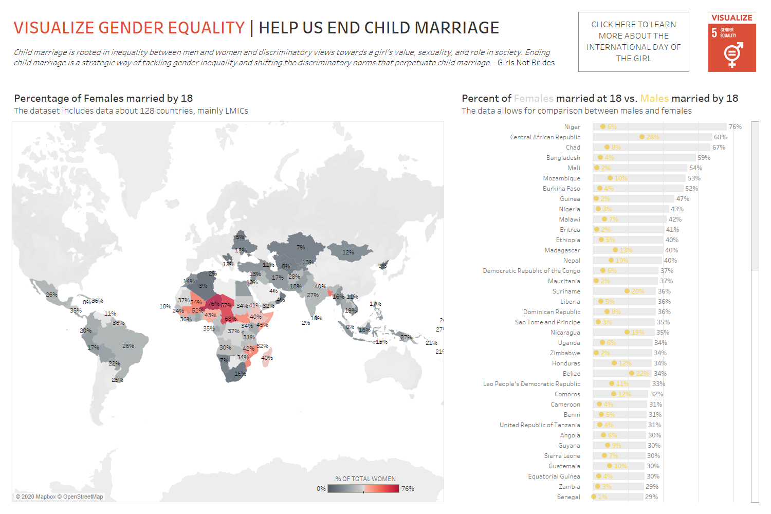{#fig-1}
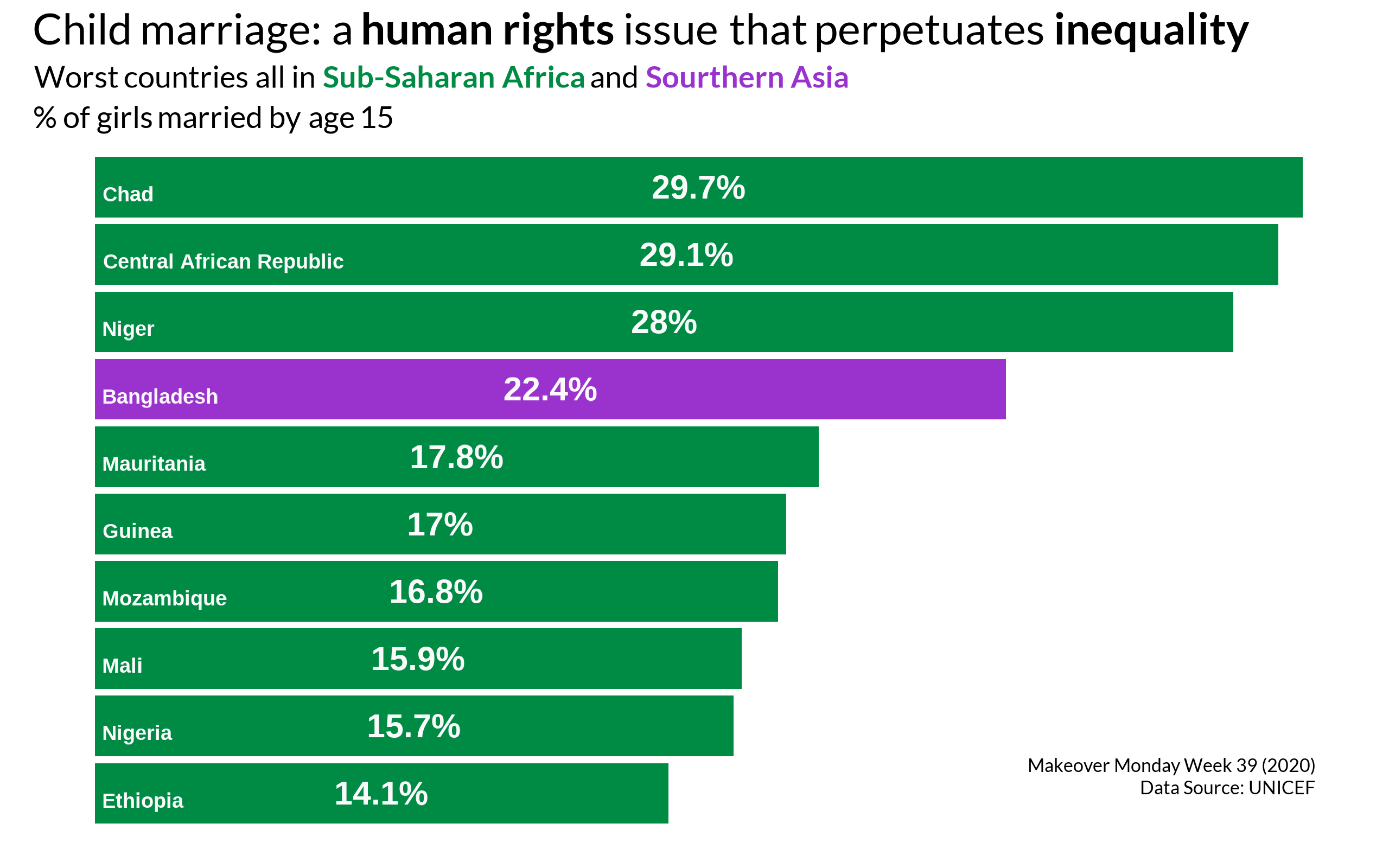
**My alternative plots**
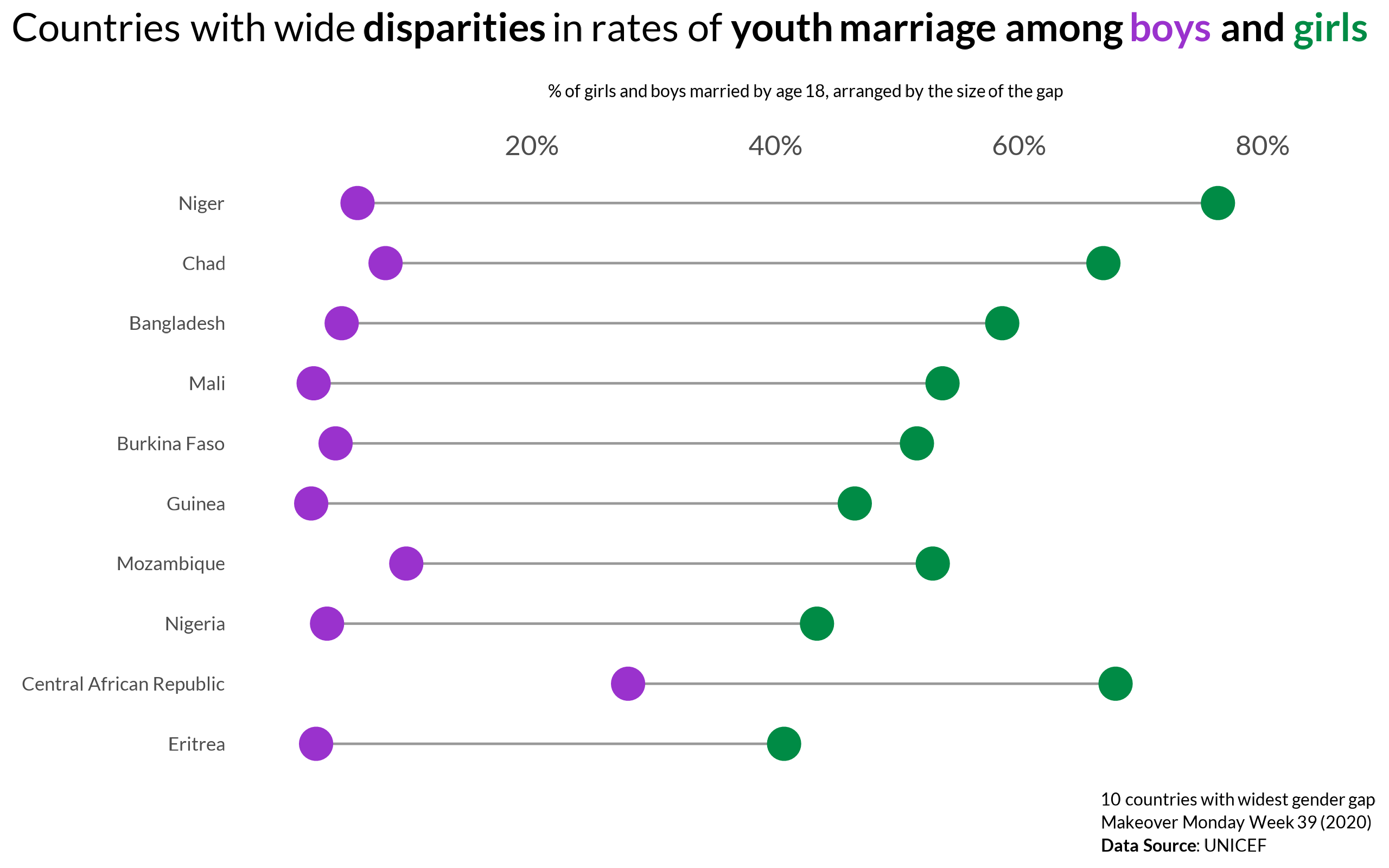
{#fig-2}
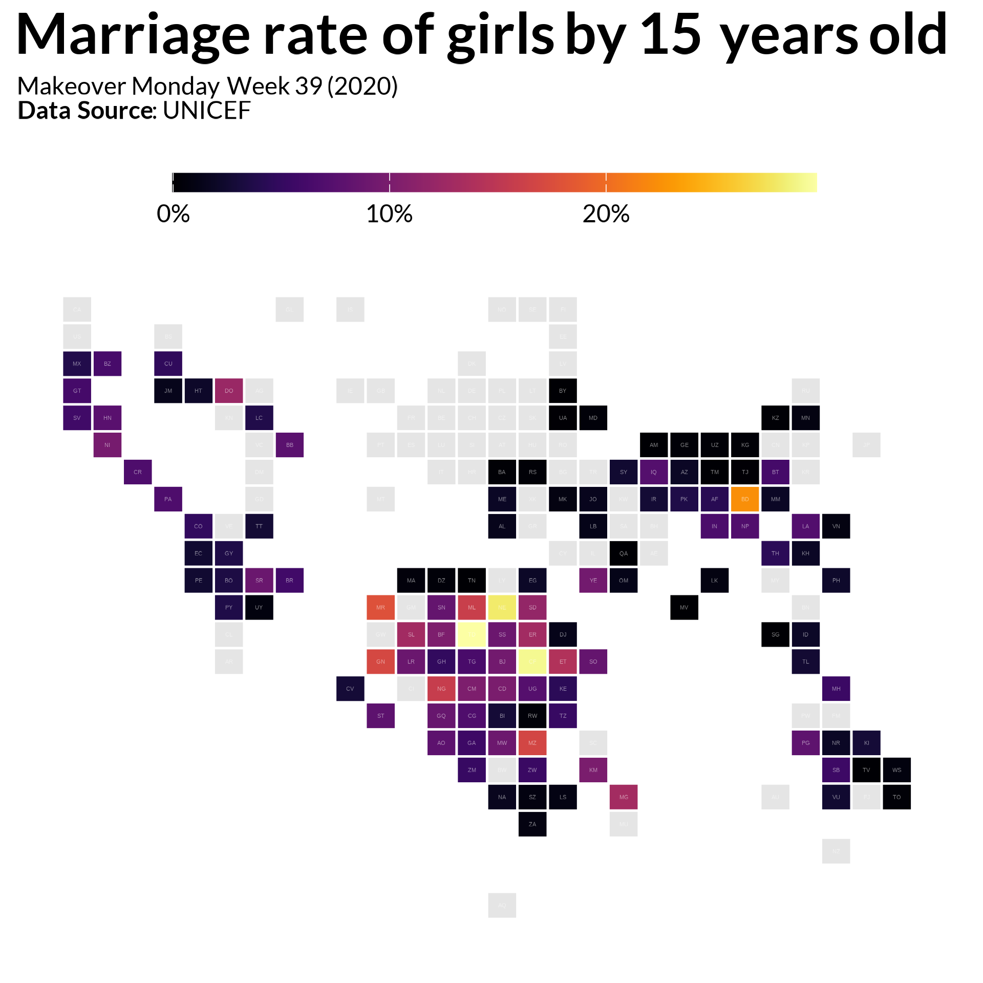
{#fig-3}
{#fig-4}
# 1. Load Packages & Setup
```{r setup, include=TRUE}
if (!require("pacman")) install.packages("pacman")
pacman::p_load(
    tidyverse,
    tidytuesdayR,
    dlookr,
    ggtext,
    gt,
    gtExtras,  #for font awesome icons in gt tables
    ggbump,
    ggalt,
    hrbrthemes,
    countrycode,
    showtext,
    janitor,   #for clean_names()
    scales,
    htmltools, #for tagList()
    glue,
    here,
    geomtextpath
)

font_add_google('Lato')
```
# 2. Read in the Data
```{r read_data, include=TRUE}
mm_year <- 2020
mm_week <- 39

df <- read.csv("https://query.data.world/s/qss24rzobvbkg6gc7y7lzfn75c4b46",
               header=TRUE, stringsAsFactors=FALSE) %>%
  clean_names()

tile_data <- read_csv("https://gist.githubusercontent.com/maartenzam/787498bbc07ae06b637447dbd430ea0a/raw/9a9dafafb44d8990f85243a9c7ca349acd3a0d07/worldtilegrid.csv")
```
# 3. Examine the Data
```{r examine, include=TRUE, echo=TRUE}
df %>%
  glimpse()
df %>%
  summary()
```
# 4. Tidy the Data
```{r tidy_df, include=TRUE}
# collect country codes and regions
codelist <- countrycode::codelist %>%
  select(un.name.en, continent,
         un.region.name, un.regionsub.name,
         iso2c) %>%
  rename(country = un.name.en) %>%
  filter(!is.na(country))

# adjust text of some names and join on codelist
df <- df %>%
  mutate(country = recode(country,
                          "Cote d'Ivoire" = "Côte D'Ivoire",
                          "Gambia" = "Gambia (Republic of The)",
                          "Guinea-Bissau" = "Guinea Bissau",
                          "Lao People's Democratic Republic" = "Lao People’s Democratic Republic")) %>%
  left_join(x=.,
            y=codelist,
            by='country')

# Namibia is missing an `alpha.2` code, so correcting that
tile_data <- tile_data %>%
  mutate(alpha.2 = if_else(is.na(alpha.2), 'NA', alpha.2))

# join tile_data with df
tile_data <- tile_data %>%
  left_join(x=.,
            y=df,
            by=c('alpha.2' = 'iso2c'))

# create top 10 dataframes for vizzes
top_10_girls15_df <- df %>%
  slice_max(order_by = females_married_by_15,
            n =10)

top_10_disparity_df <- df %>%
  mutate(diff_by_18 = females_married_by_18 - males_married_by_18) %>%
  slice_max(order_by = diff_by_18, n = 10)
```
# 5. Visualization Parameters
```{r my_theme, include=TRUE}
my_theme <- theme(
  text = element_text(family = 'Lato', size=12, color='black'),
  axis.ticks = element_blank(),
  plot.background = element_rect(color='white'),
  panel.background =  element_blank(),
  legend.background = element_blank(),
  panel.grid.major = element_line(colour = "grey90", size = 0.5),
  panel.grid.minor = element_line(colour = "grey93", size = 0.5),
  panel.border = element_blank(),
  legend.title=element_blank(),
  legend.position = 'top')

region_cols <- c('Southern Asia' = 'darkorchid3',
                 'Sub-Saharan Africa' = 'springgreen4')
```
# 6. Plot
#### Bar plot
```{r top10_viz, include=TRUE, fig.height=7, fig.width=12}
top10_viz <- top_10_girls15_df %>%
  ggplot(.,
         aes(x=females_married_by_15,
             y=reorder(country, females_married_by_15))) +
  geom_col(aes(fill=un.regionsub.name)) +
  geom_text(aes(label=paste(round(females_married_by_15 * 100, 1), '%', sep = '')),
          vjust=0.5,
          size = 16,
          position = position_stack(vjust = 0.5),
          color='grey98',
          fontface='bold') +
  geom_text(aes(x = .002, label = country),
            color = 'grey98',
            hjust = 0,
            vjust = 1,
            size = 10,
            fontface = 'bold') +
  annotate("text",
           x=.3, y=1.25,
           size=9, family="Lato",
           label = 'Makeover Monday Week 39 (2020)\nData Source: UNICEF',
           color='black',
           lineheight=.3,
           hjust = 1) +
  scale_x_continuous(labels = percent) +
  labs(x='',
       y='',
       title='Child marriage: a **human rights** issue that perpetuates **inequality**',
       subtitle=glue("Worst countries all in <span style='color:springgreen4'>**Sub-Saharan Africa**</span> and <span style='color:darkorchid3'>**Sourthern Asia**</span><br>% of girls married by age 15")) +
  scale_fill_manual(values = region_cols) +
  my_theme +
  theme(legend.position = 'none',
        plot.title = element_textbox(size=rel(5)),
        plot.subtitle = element_textbox(size=rel(3.5), lineheight = .4),
        plot.caption = element_textbox(size=rel(2), lineheight = .2),
        axis.text = element_blank(),
        axis.ticks = element_blank(),
        panel.grid.minor = element_blank(),
        panel.grid.major = element_blank())
```
#### Connected dot plot
```{r disparity_viz, include=TRUE, fig.height=7.5, fig.width=12}
disparity_viz <- top_10_disparity_df %>%
  ggplot(.) +
  geom_dumbbell(aes(x=males_married_by_18,
                    xend=females_married_by_18,
                    y=reorder(country, diff_by_18)),
                size_x = 6,
                size_xend = 6,
                color = 'gray60',
                colour_x = 'darkorchid3',
                colour_xend = 'springgreen4') +
  labs(x='<br>% of girls and boys married by age 18, arranged by the size of the gap<br>',
       y='',
       title=glue("Countries with wide **disparities** in rates of **youth marriage among <span style='color:darkorchid3'>boys</span> and <span style='color:springgreen4'>girls**</span>"),
       caption = "10 countries with widest gender gap<br>Makeover Monday Week 39 (2020)<br>**Data Source**: UNICEF") +
  scale_x_continuous(labels = c('', '20%', '40%', '60%', '80%'),
                     position = 'top') +
  expand_limits(x=c(0, .85)) +
  my_theme +
  theme(panel.grid.major = element_blank(),
        panel.grid.minor = element_blank(),
        plot.title = element_textbox(size=rel(4.5), hjust = 0),
        plot.title.position = 'plot',
        plot.caption = element_textbox(size=rel(2), lineheight = .4),
        axis.ticks = element_blank(),
        axis.title = element_textbox(size=rel(2), lineheight = .4),
        axis.text.x = element_text(size=rel(4)),
        axis.text.y = element_text(size=rel(2.75)))
```
#### Tile map
```{r tilemap_viz, fig.width=10, fig.height=9}
tilemap_viz <- tile_data %>%
  ggplot(.,
         aes(xmin = x, ymin = y, xmax = x + 1, ymax = y + 1)) +
  geom_rect(aes(fill=females_married_by_15), color = "#ffffff") +
  geom_text(aes(x = x, y = y, label = alpha.2),
            color = "#ffffff", alpha = 0.5, nudge_x = 0.5, nudge_y = -0.5, size = 3) +
  labs(title='**Marriage rate of girls by 15 years old**',
       subtitle='Makeover Monday Week 39 (2020)<br>**Data Source**: UNICEF<br>') +
  scale_y_reverse() +
  viridis::scale_fill_viridis(option = 'inferno',
                              labels = scales::percent,
                              na.value = "gray90") +
  # theme_void() +
  my_theme +
  theme(plot.title = element_textbox(size=rel(7)),
        plot.subtitle = element_textbox(size=rel(3), lineheight = .3),
        plot.background = element_rect(color='white'),
        legend.position = "top",
        legend.direction = "horizontal",
        legend.key.height = unit(0.3, "cm"),
        legend.key.width = unit(2, "cm"),
        legend.title.position = "top",
        panel.grid.major = element_blank(),
        panel.grid.minor = element_blank(),
        axis.line = element_blank(),
        axis.text = element_blank(),
        axis.title = element_blank(),
        legend.title = element_blank(),
        legend.text = element_text(size=rel(3)),
        legend.background = element_rect(fill = "white", color = NA),
        legend.spacing.x = unit(0.2, 'cm'))
```
# 7. Save
```{r save_plot, include=TRUE}
# TOP 10 PLOT
ggsave(
  filename = glue("mm_{mm_year}_{mm_week}_bar.png"),
  plot = top10_viz,
  width = 8, height = 5, units = "in", dpi = 320
)

# DISPARITY PLOT
ggsave(
  filename = glue("mm_{mm_year}_{mm_week}_dumbbell.png"),
  plot = disparity_viz,
  width = 8, height = 5, units = "in", dpi = 320
)

# TILE MAP
ggsave(
  filename = glue("mm_{mm_year}_{mm_week}_tilemap.png"),
  plot = tilemap_viz,
  width = 6, height = 6, units = "in", dpi = 320
)

# make thumbnail for page
magick::image_read(glue("mm_{mm_year}_{mm_week}_bar.png")) %>%
  magick::image_resize(geometry = "400") %>%
  magick::image_write(glue("mm_{mm_year}_{mm_week}_bar_thumbnail.png"))

magick::image_read(glue("mm_{mm_year}_{mm_week}_dumbbell.png")) %>%
  magick::image_resize(geometry = "400") %>%
  magick::image_write(glue("mm_{mm_year}_{mm_week}_dumbbell_thumbnail.png"))

magick::image_read(glue("mm_{mm_year}_{mm_week}_tilemap.png")) %>%
  magick::image_resize(geometry = "400") %>%
  magick::image_write(glue("mm_{mm_year}_{mm_week}_tilemap_thumbnail.png"))
```
# 8. Session Info
::: {.callout-tip collapse="true"}
##### Expand for Session Info
```{r session_info, echo=FALSE}
sessionInfo()
```
:::
# 9. Github Repository
::: {.callout-tip collapse="true"}
##### Expand for GitHub Repo
[Access the GitHub repository here](https://github.com/mrafa3/mrafa3.github.io)
:::


