---
title: "U.S. National Parks Visits (1904-2016)"
description: "Evaluating changes in the popularity of U.S. National Parks over time"
author:
- name: Mickey Rafa
url: https://mrafa3.github.io/
date: 12-30-2022
categories: [R, "#TidyTuesday", bump-chart] # self-defined categories
image: "tt_2019_38_thumbnail.png"
draft: false # setting this to `true` will prevent your post from appearing on your listing page until you're ready!
format:
html:
toc: true
toc-depth: 5
code-link: true
code-fold: true
code-tools: true
code-summary: "Show code"
self-contained: true
editor_options:
chunk_output_type: inline
execute:
error: false
message: false
warning: false
eval: true
---
{#fig-1}
# 1. Load Packages & Setup
```{r setup, include=TRUE}
if (!require("pacman")) install.packages("pacman")
pacman::p_load(
    tidyverse,
    tidytuesdayR,
    dlookr,
    ggtext,
    gt,
    gtExtras,  #for font awesome icons in gt tables
    ggbump,
    showtext,
    janitor,   #for clean_names()
    scales,
    htmltools, #for tagList()
    glue,
    here,
    geomtextpath
)

font_add('fa-brands', 'fonts/Font Awesome 6 Brands-Regular-400.otf')

sysfonts::font_add_google("Lato","lato")
showtext::showtext_auto()
showtext::showtext_opts(dpi=300)
```
# 2. Read in the Data
```{r read_data, include=TRUE}
tt_year <- 2019
tt_week <- 38

tuesdata <- tidytuesdayR::tt_load(tt_year, week = tt_week)

df <- tuesdata$national_parks
```
# 3. Examine the Data
```{r glimpse, include=TRUE, echo=TRUE}
df %>%
  glimpse()
```
It's important to note that there are records for sites other than U.S. National Parks, which can be identified by the `unit_type` field.
```{r diagnose, include=TRUE, echo=TRUE}
df %>%
  diagnose_category() %>%
  filter(variables == 'unit_type')
```
# 4. Tidy the Data
```{r df_annual}
df_annual <- df %>%
  filter(year != 'Total',
         unit_type == 'National Park') %>%
  mutate(year = as.numeric(year)) %>%
  mutate(decade = as.factor(year - (year %% 10))) %>%
  arrange(year) %>%
  group_by(year) %>%
  mutate(annual_visitor_rank = as.integer(rank(-visitors))) %>%
  select(annual_visitor_rank, year, unit_name, visitors, everything()) %>%
  arrange(year, annual_visitor_rank) %>%
  ungroup() %>%
  separate(col=unit_name, into = c("parkname_full", "parktype"), sep = "National Park",
           remove=FALSE)

highlight_list_annual <- df_annual %>%
  filter(year ==2016,
         annual_visitor_rank <=5) %>%
  pull(unit_name)

df_decade <- df %>%
  filter(unit_type == 'National Park',
         year != 'Total') %>%
  mutate(year = as.numeric(year)) %>%
  mutate(decade = year - (year %% 10)) %>%
  group_by(decade, unit_name) %>%
  summarise(visitors_by_decade = sum(visitors, na.rm = TRUE),
            .groups = 'drop') %>%
  group_by(decade) %>%
  mutate(rank_visitors_by_decade = as.integer(rank(-visitors_by_decade))) %>%
  ungroup() %>%
  separate(col=unit_name, into = c("parkname_full", "parktype"), sep = "National Park",
           remove=FALSE)

top_1900s <- df_decade %>% filter(decade == 1900) %>% arrange(rank_visitors_by_decade) %>% head(5) %>% pull(unit_name)

top_2010s <- df_decade %>% filter(decade == 2010) %>% arrange(rank_visitors_by_decade) %>% head(5) %>% pull(unit_name)
```
# 5. Visualization Parameters
```{r my_theme, include=TRUE}
my_theme <- theme(
text = element_text(family = 'lato'),
plot.title = element_textbox_simple(color="black", face="bold", size=20, hjust=0),
plot.subtitle = element_textbox_simple(color="black", size=12, hjust=0),
axis.title = element_blank(),
axis.text = element_blank(),
axis.ticks = element_blank(),
axis.line = element_blank(),
plot.caption = element_textbox_simple(color="black", size=12),
panel.background = element_blank(),
panel.grid.major = element_blank(),
panel.grid.minor = element_blank(),
panel.border = element_blank(),
legend.title=element_blank(),
legend.text = element_text(color="black", size=12, hjust=0),
legend.position = 'top',
strip.text = element_text(color="black", size=14))
title <- tagList(p('Ranking of popularity of U.S. National Parks'))
subtitle <- tagList(span('*by the number of visitors annually*'))
caption <- paste0("<span style='font-family:lato;'>**Source**: TidyTuesday Week 38 (2019)</span><br>",
"<span style='font-family:fa-brands;'></span>",
"<span style='font-family:lato;'>@mickey.rafa</span>",
"<span style='font-family:lato;color:white;'>....</span>",
"<span style='font-family:fa-brands;'></span>",
"<span style='font-family:lato;color:white;'>.</span>",
"<span style='font-family:lato;'>mrafa3</span>")
description_color <- 'grey40'
subtitle_2 <- tagList(span('*by the number of visitors by decade*'))
```
# 6. Plot
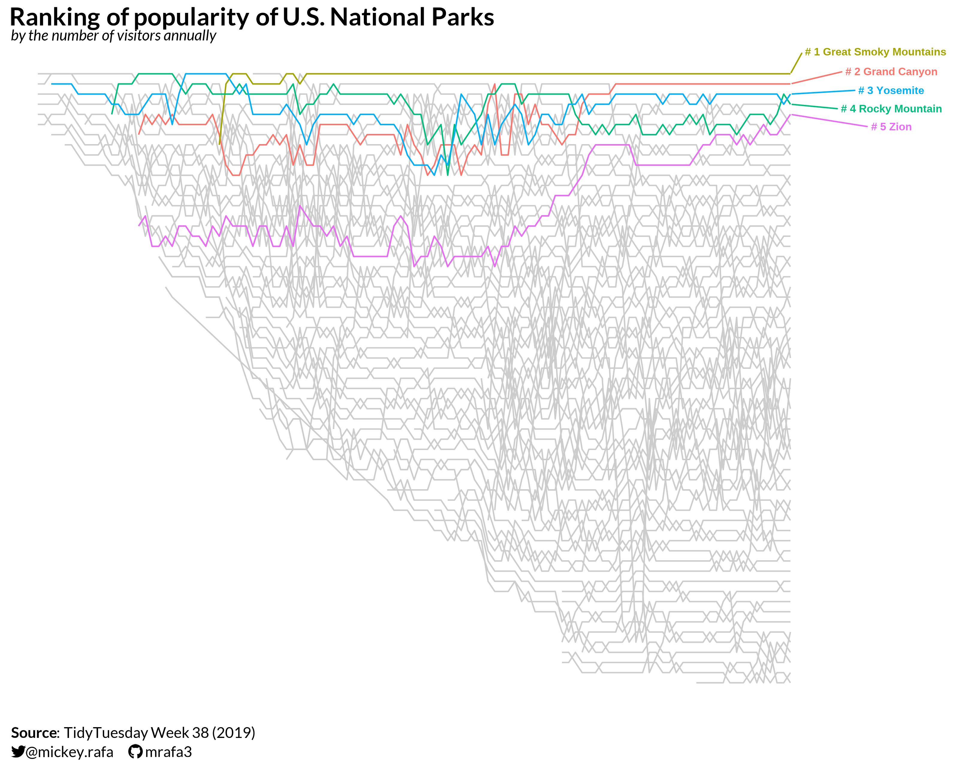
For the first plot, I wanted to replicate the bump chart created by [FiveThirtyEight](https://fivethirtyeight.com/features/the-national-parks-have-never-been-more-popular/), which shows the ranking of U.S. national parks by annual visitors.
```{r plot_viz_538, include=TRUE, fig.width=10, fig.height=6, fig.align='center'}
(plot_viz_538 <- df_annual %>%
  ggplot(.,
         aes(x=year,
             y=-annual_visitor_rank,
             group=unit_name,
             color=unit_name)) +
  geom_line(color='gray80') +
  geom_line(data=. %>% filter(unit_name %in% highlight_list_annual)) +
  ggrepel::geom_text_repel(
    data = df_annual %>% filter(year == 2016, unit_name %in% highlight_list_annual),
    aes(label = paste("#", annual_visitor_rank, parkname_full)),
    nudge_x = 15,
    size = 3,
    direction = 'y',
    fontface = 'bold'
  ) +
  labs(x='',
       title = title,
       subtitle = subtitle,
       caption = caption) +
  coord_cartesian(xlim = c(1900, 2040), ylim = c(-65, 2), expand = F) +
  my_theme +
  theme(legend.position = 'none'))
```
I like this high-level plot, and I think it's effective if you want to highlight individual parks (or show a top 5, as I've done), but there is plenty of noise. In the next plot, I aggregated visitors by decade, and I'm only showing parks that were in the top five in the first decade of the dataset or the last decade. This strips out the noise and shows some interesting changes in park rankings over time.
```{r viz_decade_bump, include=TRUE, fig.width=10, fig.height=6, fig.align='center'}
(plot_viz_decade_bump <- df_decade %>%
  filter(unit_name %in% c(top_1900s, top_2010s),
         decade >= 1900) %>%
  ggplot(.,
         aes(x=decade,
             y=-rank_visitors_by_decade,
             col=unit_name)) +
  geom_point(shape = '|', stroke = 6) +
  geom_bump(linewidth = 1) +
  ggrepel::geom_text_repel(
    data = df_decade %>% filter(decade == 1900, unit_name %in% top_1900s),
    aes(label = paste('#',rank_visitors_by_decade, " ", parkname_full, sep = "")),
    #nudge_x = -1,
    hjust = 1,
    size = 4,
    direction = "y",
    fontface = 'bold'
  ) +
  ggrepel::geom_text_repel(
    data = df_decade %>% filter(decade == 2010, unit_name %in% top_2010s),
    aes(label = paste('#',rank_visitors_by_decade, " ", parkname_full, sep = "")),
    hjust = 0,
    nudge_x = 1,
    size = 4,
    direction = "y",
    fontface = 'bold'
  ) +
  geom_text(
    data = df_decade %>% filter(decade == 2010, unit_name %in% c('Hot Springs National Park', 'Wind Cave National Park', 'Crater Lake National Park')),
    aes(label = paste('#',rank_visitors_by_decade, " ", parkname_full, sep = "")),
    hjust = 0,
    nudge_x = 1,
    size = 4,
    fontface = 'bold'
  ) +
  annotate(
    'text',
    x = c(1898, 2012),
    y = c(5, 5),
    label = c('1900s', '2010s'),
    hjust = c(0, 1),
    vjust = 1,
    size = 6,
    fontface = 'bold') +
  coord_cartesian(xlim = c(1860, 2070), ylim = c(-45, 10), expand = F) +
  #theme_void() +
  my_theme +
  theme(legend.position = 'none',
        panel.grid.major.x = element_blank(),
        panel.grid.minor.x = element_blank(),
    text = element_text(
      color = description_color
    )
  ) +
  labs(
    title = title,
    subtitle = subtitle_2,
    caption = caption
  ))
```
# 7. Save
```{r save_plot, include=TRUE}
# Save the plot as PNG
ggsave(
  filename = glue("tt_{tt_year}_{tt_week}.png"),
  plot = plot_viz_538,
  width = 10, height = 8, units = "in", dpi = 320
)

# make thumbnail for page
magick::image_read(glue("tt_{tt_year}_{tt_week}.png")) %>%
  magick::image_resize(geometry = "400") %>%
  magick::image_write(glue("tt_{tt_year}_{tt_week}_thumbnail.png"))
```
# 8. Session Info
::: {.callout-tip collapse="true"}
##### Expand for Session Info
```{r, echo = FALSE}
sessionInfo()
```
:::
# 9. Github Repository
::: {.callout-tip collapse="true"}
##### Expand for GitHub Repo
[Access the GitHub repository here](https://github.com/mrafa3/mrafa3.github.io)
:::


