---
title: "Visualizing the prevalence and occurence of modern slavery globally"
description: "Remaking a table from the Global Slavery Index Report (2023) by Walk Free"
author:
- name: Mickey Rafa
url: https://mrafa3.github.io/
date: 12-12-2024
categories: [R, "#MakeoverMonday", gt, bubble-chart] # self-defined categories
image: "mm_2024_47_thumbnail.png"
draft: false # setting this to `true` will prevent your post from appearing on your listing page until you're ready!
format:
html:
toc: true
toc-depth: 5
code-link: true
code-fold: true
code-tools: true
code-summary: "Show code"
self-contained: true
editor_options:
chunk_output_type: inline
execute:
error: false
message: false
warning: false
eval: true
---
{#fig-1}
{#fig-2}
{#fig-3}
# 1. Load Packages & Setup
```{r setup, include=TRUE}
if (!require("pacman")) install.packages("pacman")
pacman::p_load(
    tidyverse,
    devtools,
    httr,
    readxl,
    dlookr,
    ggtext,
    gt,
    gtExtras,  #for font awesome icons in gt tables
    ggbump,
    ggcirclepack,
    showtext,
    tidycountries,
    janitor,   #for clean_names()
    scales,
    patchwork,
    htmltools, #for tagList()
    glue,
    here,
    geomtextpath
)

# install_github("EvaMaeRey/ggcirclepack")
```
# 2. Read in the Data
```{r read_data, include=TRUE}
#| echo=FALSE
mm_year <- 2024
mm_week <- 47
GET("https://query.data.world/s/z5q77nd26spalnn6hu632vkjp4xsie?dws=00000", write_disk(tf <- tempfile(fileext = ".xlsx")))
df <- read_excel(tf) %>%
clean_names()
country_df <- tidycountries::restcountries_tidy_data %>%
select(common_name, official_name, flags_png) %>%
distinct()
```
# 3. Examine the Data
```{r examine, include=TRUE}
#| echo=FALSE
df %>%
diagnose()
```
# 4. Tidy the Data
```{r tidy_data, include=TRUE}
df <- df %>%
  mutate(country = case_match(country,
                              'Türkiye' ~ 'Turkey',
                              'United States of America' ~ 'United States',
                              'Democratic Republic of the Congo' ~ 'DR Congo',
                              'Viet Nam' ~ 'Vietnam',
                              "Côte d'Ivoire" ~ 'Ivory Coast',
                              'Lao PDR' ~ 'Laos',
                              'Brunei Darussalam' ~ 'Brunei',
                              .default = country),
         percentile_nmbr_in_slavery =
           round(100 * percent_rank(estimated_number_of_people_in_modern_slavery), 0),
         rank_prevalence = rank(-estimated_prevalence_of_modern_slavery_per_1_000_population),
         rank_absolute = round(rank(-estimated_number_of_people_in_modern_slavery), 0),
         perc_ttl_nmbr_in_slavery = estimated_number_of_people_in_modern_slavery / sum(estimated_number_of_people_in_modern_slavery, na.rm=TRUE)) %>%
  left_join(x=.,
            y=country_df,
            by=c('country' = 'common_name'))
```
# 5. Evaluate the Original Plot
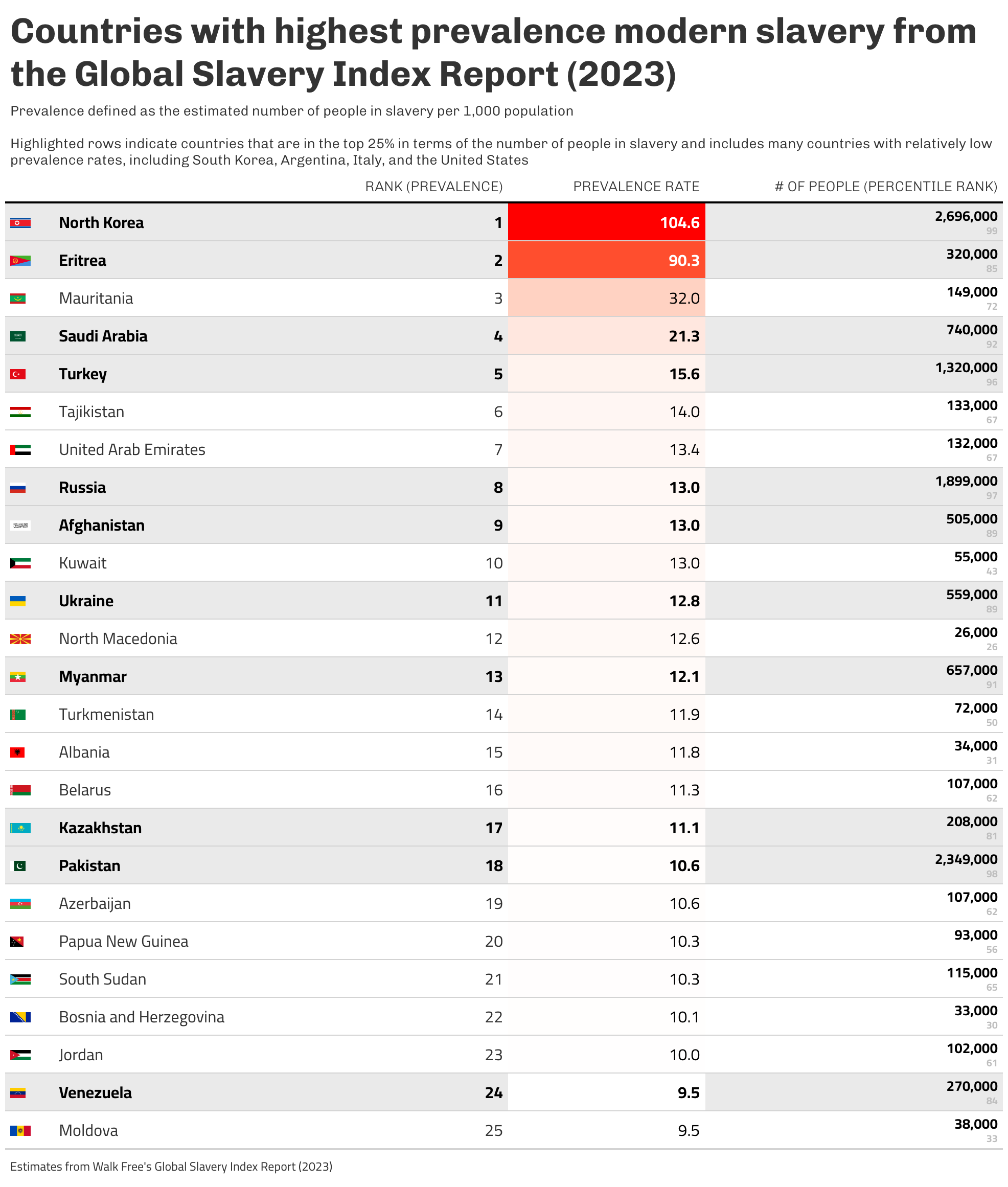
{#fig-2}
This is an interesting dataset that reminds me of some work that I contributed to at the Pardee Center. There's a lot that could be explored here, including things like mapping or analyzing the data with cluster analysis or PCA.
I like a chart to display this information, but there’s some elements that I’ll reconsider:
* The **color encoding of prevalence rate has no meaning**. It's also odd/counterintuitive to use yellow for the countries with the highest prevalence and red for those with the lowest.
* The **chart titles aren't clear as a standalone**, and I typically prefer to make charts that can be lifted from reports while maintaining enough context to explain.
* The **number of people estimated to be in modern slavery is washed out** by the prevalence rates. Yes, prevalence rate likely corresponds to the subtitle of the charts – countries with poor governance or high conflict zones are likely to have higher rates of slavery. But I couldn’t help but notice Japan’s estimate is very high, despite it being among the bottom 10 in prevalence rate. There could be something there to work on. Maybe adding a column for percentile rank of the number of people estimated to be in slavery conditions.
* Slicing this and show the top and bottom 10 by prevalence rate is an efficient use of space, but the distribution of **prevalence rate is heavily skewed, which seems to make that approach less meaningful**.
* I'd like to **add the country flags** to the table, because it's a small design element that improves the recognition of some countries (at least for some). I have never used the {tidycountries} package, so I'll give that a try.
# 6. Visualization Parameters
```{r viz_params, include=TRUE}
region_cols <- c('Asia and the Pacific' = "#8dd3c7",
                 'Europe and Central Asia' = "#ffffb3",
                 'Africa' = "#bebada",
                 'Americas' = "#fb8072",
                 'Arab States' = "#80b1d3")

region_cols_alpha <- sapply(region_cols, alpha, alpha = 0.2)

my_theme <- theme(
  text = element_text(family = 'Lato', size=12, color='black'),
  axis.ticks = element_blank(),
  plot.background = element_rect(color='white'),
  panel.background =  element_blank(),
  legend.background = element_blank(),
  panel.grid.major = element_blank(),
  panel.grid.minor = element_blank(),
  panel.border = element_blank(),
  legend.title=element_blank(),
  legend.position = 'none')
```
# 7. Plot
```{r gt_walk_free, include=TRUE, fig.align='center'}
gt_walk_free <- df %>%
  select(flags_png, country, rank_prevalence, estimated_prevalence_of_modern_slavery_per_1_000_population, estimated_number_of_people_in_modern_slavery, percentile_nmbr_in_slavery) %>%
  arrange(rank_prevalence) %>%
  slice_max(n=25, estimated_prevalence_of_modern_slavery_per_1_000_population) %>%
  gt() %>%
  cols_label(country = '',
             flags_png = '',
             rank_prevalence = 'Rank (Prevalence)',
             estimated_prevalence_of_modern_slavery_per_1_000_population = 'Prevalence Rate',
             estimated_number_of_people_in_modern_slavery = '# of People (percentile rank)') %>%
  tab_header(title = md("**Countries with highest prevalence modern slavery from the Global Slavery Index Report (2023)**"),
             subtitle = md("Prevalence defined as the estimated number of people in slavery per 1,000 population<br><br>Highlighted rows indicate countries that are in the top 25% in terms of the number of people in slavery and includes many countries with relatively low prevalence rates, including South Korea, Argentina, Italy, and the United States")) %>%
  tab_source_note(source_note = "Estimates from Walk Free's Global Slavery Index Report (2023)") %>%
  gt_merge_stack(col1 = estimated_number_of_people_in_modern_slavery, col2 = percentile_nmbr_in_slavery) %>%
  fmt_number(columns = estimated_number_of_people_in_modern_slavery,
             decimals = 0) %>%
  fmt_number(columns = estimated_prevalence_of_modern_slavery_per_1_000_population,
             decimals = 1) %>%
  gt_img_rows(
    columns = flags_png,
    height = 10
  ) %>%
  gt_highlight_rows(
    rows = percentile_nmbr_in_slavery >= 75,# a logic statement
    fill = "gray90",
    bold_target_only = FALSE) %>%
  tab_style(
    style = cell_text(size = px(35)),
    locations = cells_title(groups = "title")
  ) %>%
  data_color(columns = estimated_prevalence_of_modern_slavery_per_1_000_population,
             palette = c("white", "red")) %>%
  gt_theme_538()
```
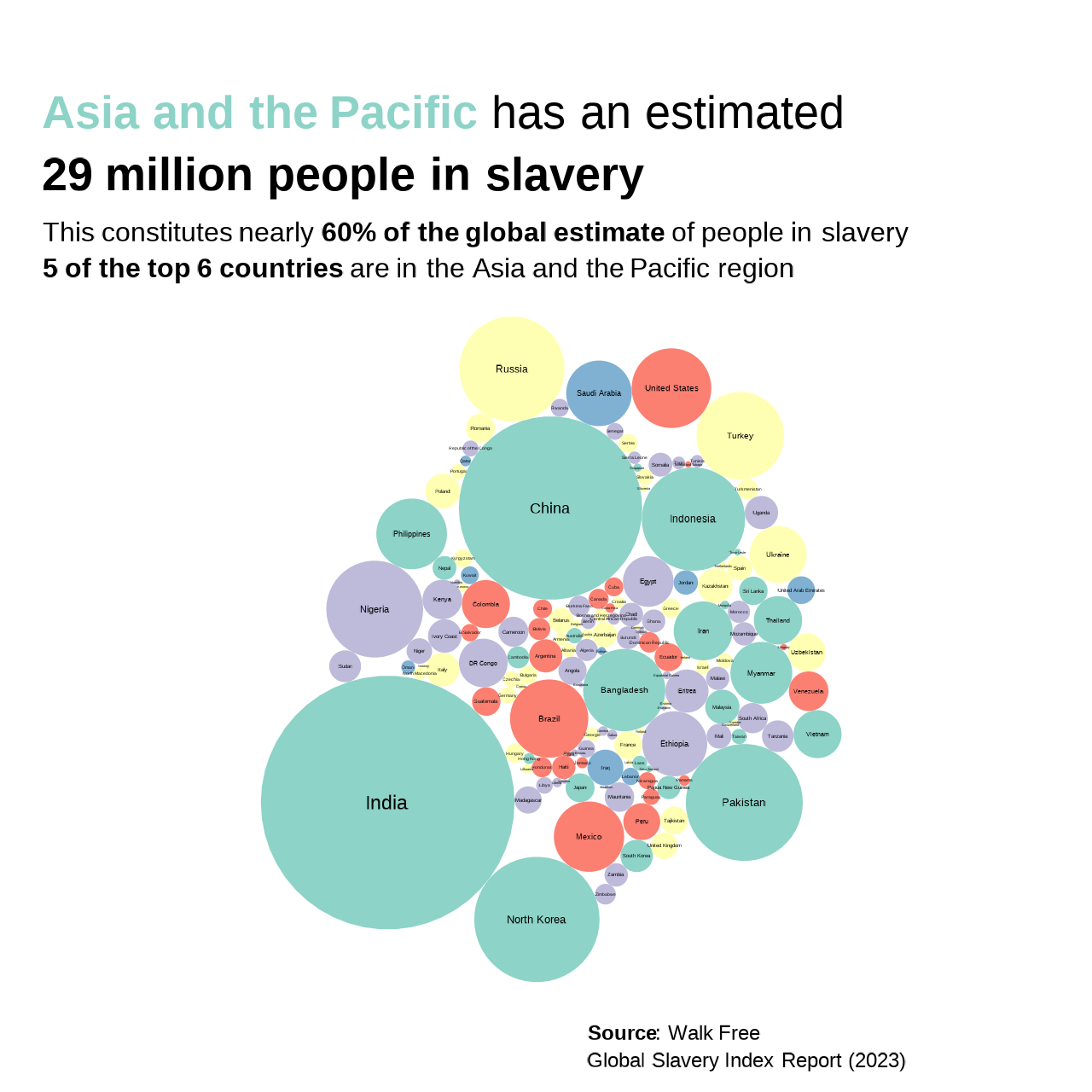
```{r ggcirclepack, include=TRUE, fig.width=9}
#| warning=FALSE
plot_circlepack <- df %>%
   filter(complete.cases(.)) %>%
   ggplot(.,
       aes(id=country,
           area=estimated_number_of_people_in_modern_slavery,
           fill=region)) +
  ggcirclepack::geom_circlepack(linewidth = 1) +
  ggcirclepack::geom_circlepack_text() +
  coord_fixed() +
  labs(title=glue("<span style='color:#8dd3c7'>**Asia and the Pacific**</span> has an estimated **29 million people in slavery**"),
       subtitle='This constitutes nearly **60% of the global estimate** of people in slavery<br>**5 of the top 6 countries** are in the Asia and the Pacific region',
       caption='**Source**: Walk Free<br>Global Slavery Index Report (2023)') +
  scale_fill_manual(values = region_cols) +
  my_theme +
  theme(plot.title = element_textbox_simple(size=rel(3.4), margin = margin(t=20, b=6, l=-50),
                                            lineheight = .4),
        plot.subtitle = element_textbox(size=rel(2), margin = margin(l=-50), lineheight = .4),
        plot.caption = element_textbox(size=rel(1.5), margin = margin(r=-10), lineheight = .4),
        axis.text = element_blank())
```
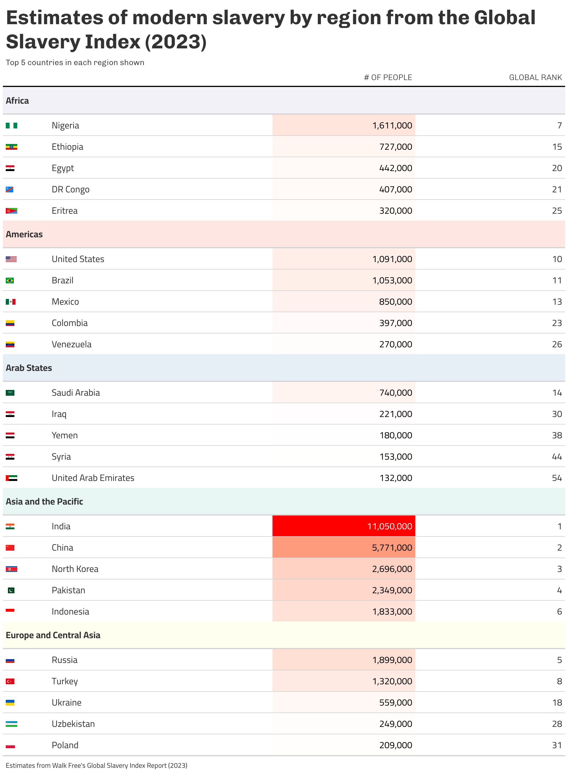
```{r gt_walk_free_2, include=TRUE}
gt_walk_free_region_top_5 <- df %>%
  group_by(region) %>%
  slice_max(n=5, estimated_number_of_people_in_modern_slavery) %>%
  ungroup() %>%
  select(flags_png, country, region, estimated_number_of_people_in_modern_slavery, rank_absolute) %>%
  gt(groupname_col = 'region') %>%
  cols_label(country = '',
             flags_png = '',
             estimated_number_of_people_in_modern_slavery = '# of People',
             rank_absolute = 'Global Rank') %>%
  tab_header(title = md("**Estimates of modern slavery by region from the Global Slavery Index (2023)**"),
             subtitle = "Top 5 countries in each region shown") %>%
  tab_source_note(source_note = "Estimates from Walk Free's Global Slavery Index Report (2023)") %>%
  # gt_merge_stack(col1 = estimated_number_of_people_in_modern_slavery, col2 = percentile_nmbr_in_slavery) %>%
  fmt_number(columns = estimated_number_of_people_in_modern_slavery,
             decimals = 0) %>%
  gt_img_rows(
    columns = flags_png,
    height = 10
  ) %>%
  data_color(columns = estimated_number_of_people_in_modern_slavery,
             palette = c("white", "red")) %>%
  tab_style(
    style = list(
      cell_fill(color = region_cols_alpha['Asia and the Pacific']),
      cell_text(weight = "bold")
    ),
    locations = cells_row_groups(groups = "Asia and the Pacific")
  ) %>%
  tab_style(
    style = list(
      cell_fill(color = region_cols_alpha['Europe and Central Asia']),
      cell_text(weight = "bold")
    ),
    locations = cells_row_groups(groups = "Europe and Central Asia")
  ) %>%
  tab_style(
    style = list(
      cell_fill(color = region_cols_alpha['Africa']),
      cell_text(weight = "bold")
    ),
    locations = cells_row_groups(groups = "Africa")
  ) %>%
  tab_style(
    style = list(
      cell_fill(color = region_cols_alpha['Americas']),
      cell_text(weight = "bold")
    ),
    locations = cells_row_groups(groups = "Americas")
  ) %>%
  tab_style(
    style = list(
      cell_fill(color = region_cols_alpha['Arab States']),
      cell_text(weight = "bold")
    ),
    locations = cells_row_groups(groups = "Arab States")
  ) %>%
  tab_style(
    style = cell_text(size = px(35)),
    locations = cells_title(groups = "title")
  ) %>%
  gt_theme_538()
```
# 8. Save
```{r save_plot, include=TRUE}
# TOP 25 PREVALENCE TABLE
gt_walk_free %>%
  gtsave(
  filename = glue("mm_{mm_year}_{mm_week}.png"),
  path = here::here('.//visualizations/2024-12-12-mm-wk47-2024/')
)

# CIRCLE PLOT
ggsave(
  filename = glue("mm_{mm_year}_{mm_week}_circlepack.png"),
  plot = plot_circlepack,
  width = 4, height = 4, units = "in", dpi = 320
)

# TOP 5 BY REGION TABLE
gt_walk_free_region_top_5 %>%
  gtsave(
  filename = glue("mm_{mm_year}_{mm_week}_top5_by_region.png"),
  path = here::here('.//visualizations/2024-12-12-mm-wk47-2024/')
)

# make thumbnail for page
magick::image_read(glue("mm_{mm_year}_{mm_week}_circlepack.png")) %>%
  magick::image_resize(geometry = "400") %>%
  magick::image_write(glue("mm_{mm_year}_{mm_week}_thumbnail.png"))
```
# 9. Session Info
::: {.callout-tip collapse="true"}
##### Expand for Session Info
```{r, echo = FALSE}
sessionInfo()
```
:::
# 10. Github Repository
::: {.callout-tip collapse="true"}
##### Expand for GitHub Repo
[Access the GitHub repository here](https://github.com/mrafa3/mrafa3.github.io)
:::


