library(tidyverse)
library(CDCPLACES)
Warning: package 'CDCPLACES' was built under R version 4.4.1library(ggtext)
library(maps)
library(sf)
library(patchwork)CDCPLACES:: packagelibrary(tidyverse)
library(CDCPLACES)Warning: package 'CDCPLACES' was built under R version 4.4.1library(ggtext)
library(maps)
library(sf)
library(patchwork)In Part One, I used the CDCPLACES:: package to easily access and visualize health data from the Centers for Disease Control. In this post, I’ll demonstrate how to improve the visual style of a U.S. map, while using data from the CDC PLACES project.
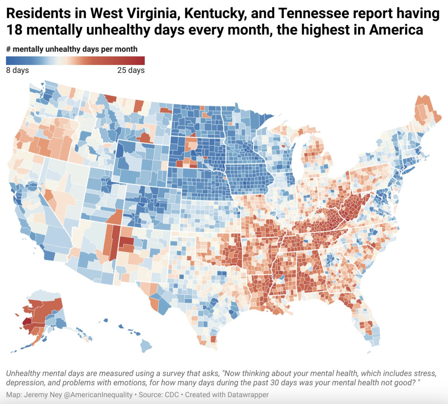
I really like the aesthetic of maps created by the American Inequality project, which uses Datawrapper as its visualization tool for their newsletter. There are several elements of their aesthetic that I think are effective (see the example map below):
df_depression <- get_places(geography = 'county',
                            measure = 'DEPRESSION',
                            release = '2024',
geometry = TRUE)(lower48_map <- df_depression %>%
filter(data_value_type == 'Crude prevalence',
!stateabbr %in% c('AK', 'HI')) %>%
ggplot(.) +
geom_sf(aes(fill=data_value/100)) +
coord_sf(datum = NA) +
scale_fill_gradient2(
low = "#2469b3",
mid = "#f0eee5",
high = "#b6202c",
midpoint = median(df_depression$data_value/100, na.rm = TRUE),
labels = scales::percent,
name = ''
) +
ggtitle('Depression among adults aged >= 18 years',
subtitle = 'by U.S. county in 2022') +
labs(x='',
y='') +
labs(caption='Source: U.S. Centers for Disease Control (PLACES product)') +
guides(color='none') +
theme_minimal())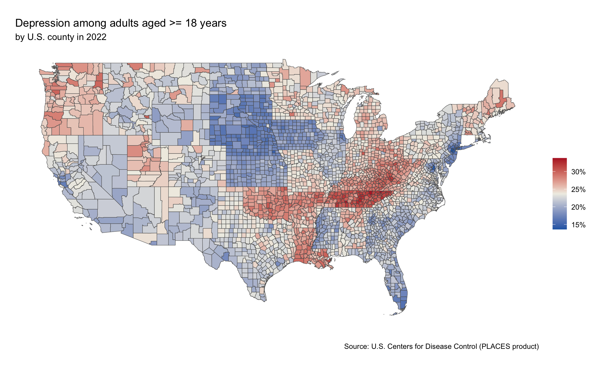
(lower48_map <- df_depression %>%
  filter(data_value_type == 'Crude prevalence',
         !stateabbr %in% c('AK', 'HI')) %>%
  ggplot(.) +
  geom_sf(aes(fill=data_value/100)) +
  coord_sf(datum = NA) +
  scale_fill_gradient2(
    low = "#2469b3",
    mid = "#f0eee5",
    high = "#b6202c",
    midpoint = median(df_depression$data_value/100, na.rm = TRUE),
    labels = scales::percent,
    name = ''
  ) +
  ggtitle('Rates of depression among adults are highest in\nCentral Appalachia and the Bible Belt',
          subtitle = '% of adults over 18 years old by U.S. county in 2022') +
  labs(x='',
       y='') +
  labs(caption='Source: U.S. Centers for Disease Control (PLACES product)') +
  guides(color='none') +
  theme_minimal() +
  theme(
    text = element_text(family = 'Roboto Condensed'),
    plot.title = element_text(face = 'bold', size=20),
    plot.subtitle = element_text(size=14),
    legend.position = "top",
    legend.direction = "horizontal",
    legend.key.height = unit(0.5, "cm"),
    legend.key.width = unit(2, "cm"),
    legend.title.position = "top",
    legend.title = element_blank(),
    legend.background = element_rect(fill = "white", color = NA),
    legend.spacing.x = unit(0.2, 'cm')
    ))
I want to the map to have thicker state boundaries than county boundaries – I think that’s a nice look and a nice way to orient readers to differences in state outcomes. I’ll use the maps::map_data() function to pull in the state boundaries and overlay those onto my county-based data.
states <- map_data("state")(lower48_map <- df_depression %>%
filter(data_value_type == 'Crude prevalence',
!stateabbr %in% c('AK', 'HI')) %>%
ggplot(.) +
geom_sf(aes(fill=data_value/100), color='white') +
# this is what imitates the Datawrapper aesthetic of thicker state borders than county borders
geom_polygon(data = states,
aes(x = long, y = lat, group = group),
fill = NA, color = "white", linewidth = 0.5) +
coord_sf(datum = NA) +
scale_fill_gradient2(
low = "#2469b3",
mid = "#f0eee5",
high = "#b6202c",
midpoint = median(df_depression$data_value/100, na.rm = TRUE),
labels = scales::percent,
name = ''
) +
ggtitle('Rates of depression among adults are highest in\nCentral Appalachia and the Bible Belt',
subtitle = '% of adults over 18 years old by U.S. county in 2022') +
labs(x='',
y='') +
labs(caption='Source: U.S. Centers for Disease Control (PLACES product)') +
guides(color='none') +
theme_minimal() +
theme(
text = element_text(family = 'Roboto Condensed'),
plot.title = element_text(face = 'bold', size=20),
plot.subtitle = element_text(size=14),
legend.position = "top",
legend.direction = "horizontal",
legend.key.height = unit(0.5, "cm"),
legend.key.width = unit(2, "cm"),
legend.title.position = "top",
legend.title = element_blank(),
legend.background = element_rect(fill = "white", color = NA),
legend.spacing.x = unit(0.2, 'cm')
))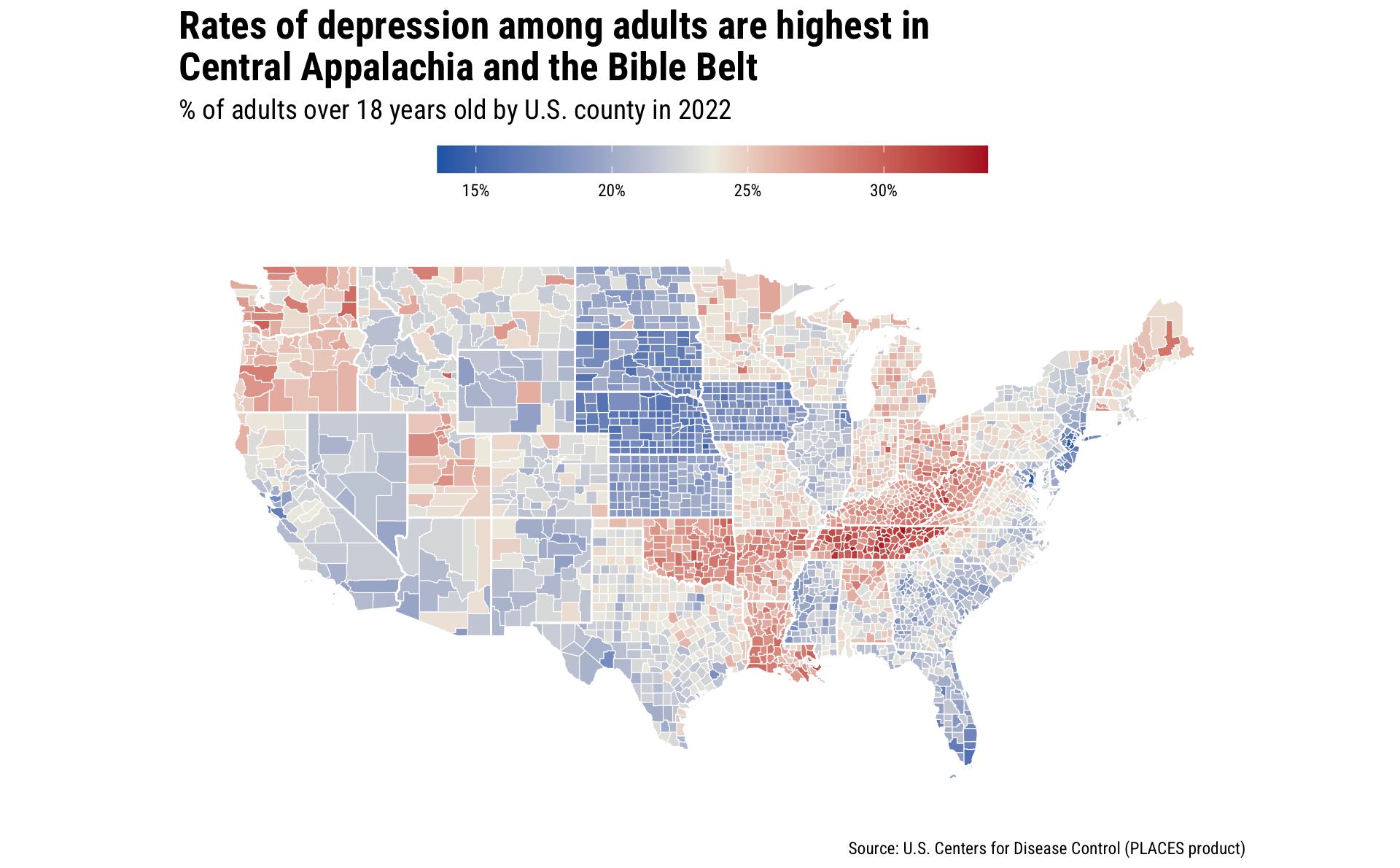
To incorporate Alaska and Hawaii with the lower 48 map, I’ll create individual maps for each and then use patchwork::inset_element() to overlay their images in the bottom left corner of the graphic.
(Note: for these, I used Claude to provide me with the map projections and coordinates – I didn’t know these or use trial and error.)
(ak_map <- df_depression %>%
  filter(data_value_type == 'Crude prevalence',
         stateabbr %in% c('AK')) %>%
  ggplot(.) +
  geom_sf(aes(fill=data_value/100), color='white') +
  coord_sf(crs = st_crs(3338), # Alaska Albers projection
           xlim = c(-2400000, 1600000),
           ylim = c(400000, 2500000),
           datum = NA) +
  scale_fill_gradient2(
    low = "#2469b3",
    mid = "#f0eee5",
    high = "#b6202c",
    midpoint = median(df_depression$data_value/100, na.rm = TRUE)
  ) +
  labs(x='',
       y='') +
  labs() +
  guides(fill='none', color='none') +
  theme_minimal())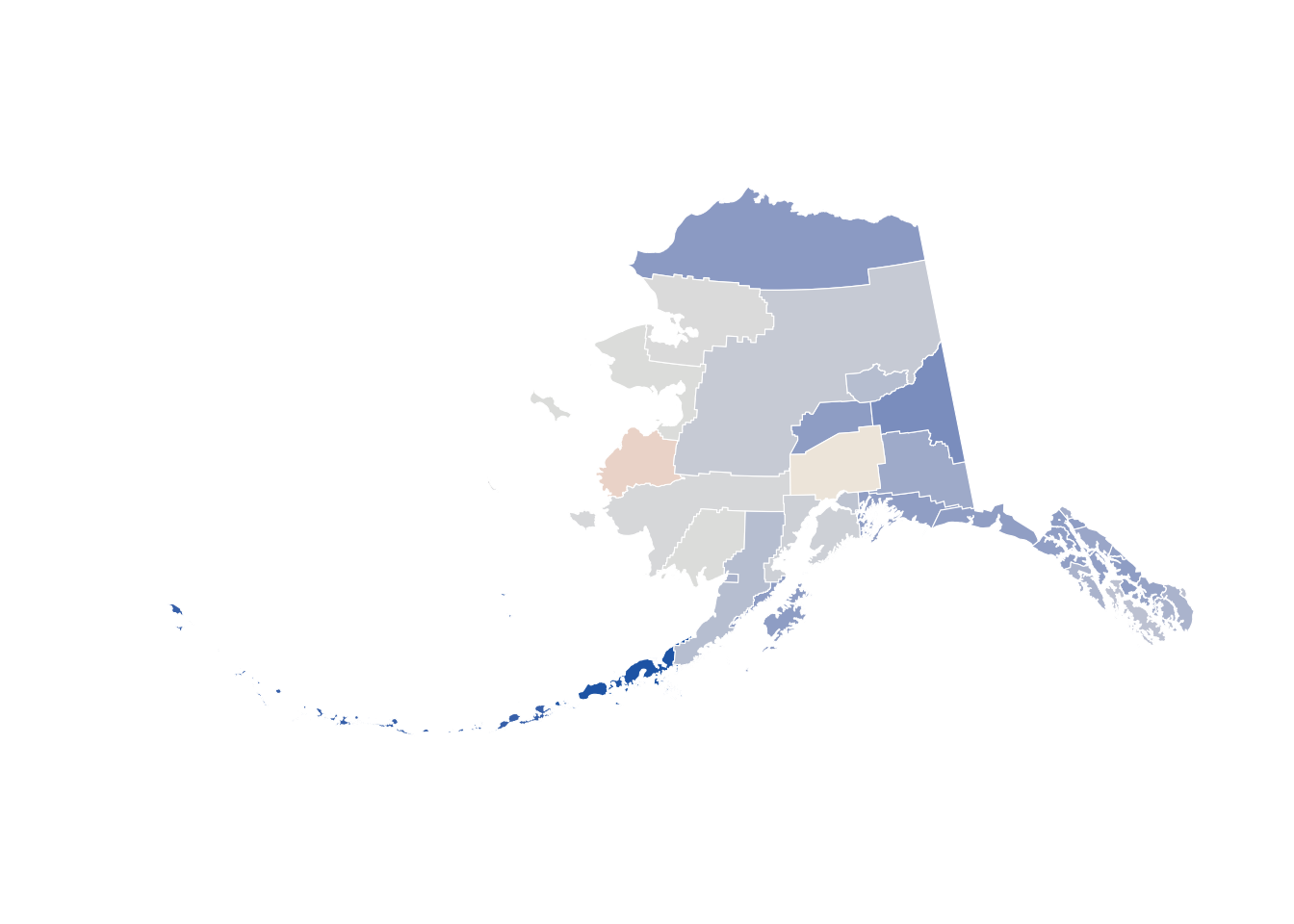
(hi_map <- df_depression %>%
  filter(data_value_type == 'Crude prevalence',
         stateabbr %in% c('HI')) %>%
  ggplot(.) +
  geom_sf(aes(fill=data_value/100), color='white') +
  coord_sf(crs = st_crs(4135), # Hawaii Albers projection
           xlim = c(-161, -154),
           ylim = c(18.5, 22.5),
           datum = NA) +
  scale_fill_gradient2(
    low = "#2469b3",
    mid = "#f0eee5",
    high = "#b6202c",
    midpoint = median(df_depression$data_value/100, na.rm = TRUE)
  ) +
  labs(x='',
       y='') +
  labs() +
  guides(fill='none', color='none') +
  theme_minimal())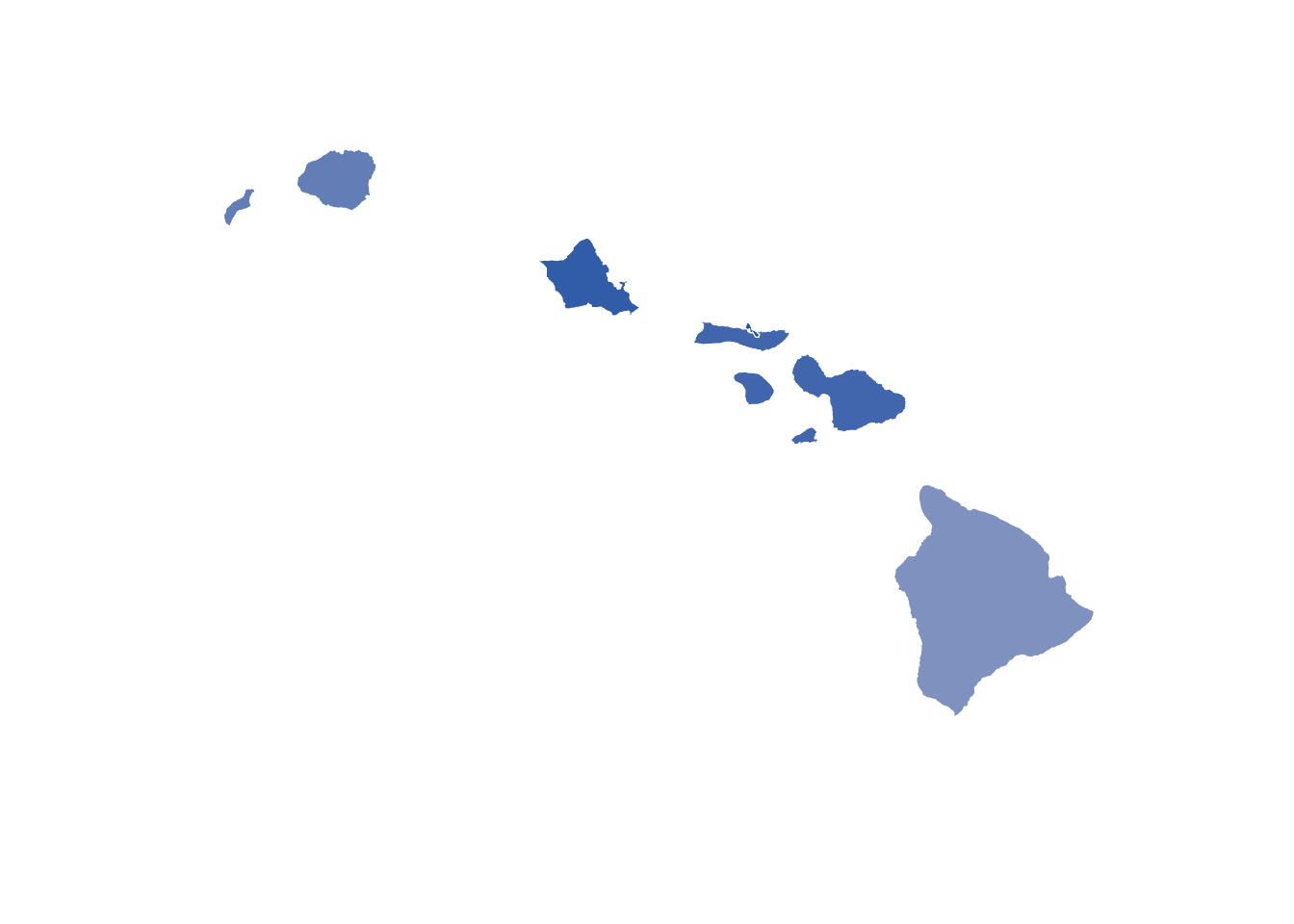
Then, with the patchwork::inset_element() function, I overlayed the Alaska and Hawaii maps to show all 50 states together, as is commonly done.
(combined_map <- lower48_map +
  inset_element(ak_map, left = -.1, bottom = -.1, right = .3, top = .3) +
  inset_element(hi_map, left = .1, bottom = -.1, right = 0.5, top = 0.2))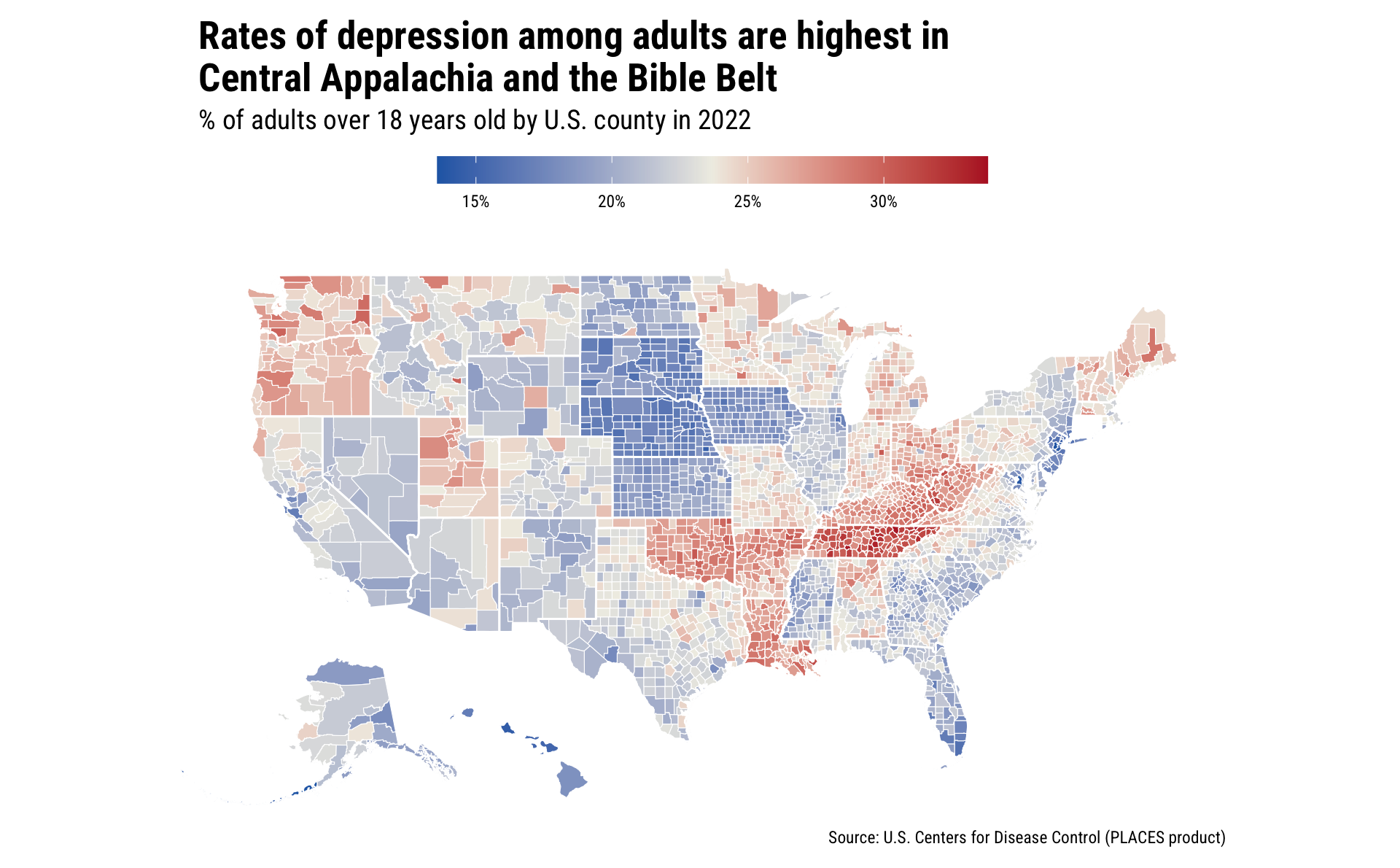
This map shows some strong regional patterns of depression in the U.S., where the Pacific Northwest, the Northeast, and the Bible Belt/ Rust Belt states all show higher rates of depression among adults.
Since this is a mapping aesthetic that I really like, I want to create a function that I’ll put into a personal package of mine.
It’s very easy to create your own theme. Pro tip: the pre-set themes in R (such as theme_minimal()) have parameters set for dozens of aesthetic elements for graphics. If you’re creating your own theme, it’s likely that you won’t want to set values for each of these arguments, so you can leverage another theme as your base theme. For this theme, I’ll use theme_minimal() as my base theme, and use the %+replace% argument to modify some of the elements that I care about.
theme_american_inequality_map <- function() {
  theme_minimal() %+replace%
    theme(
      text = element_text(family = 'Roboto Condensed'),
      plot.title = element_text(face = 'bold'),
      plot.title.position = 'plot',
      legend.position = "top",
      legend.direction = "horizontal",
      legend.key.height = unit(0.5, "cm"),
      legend.key.width = unit(2, "cm"),
      legend.title.position = "top",
      legend.title = element_blank(),
      legend.background = element_rect(fill = "white", color = NA),
      legend.spacing.x = unit(0.2, 'cm')
    )
}
You can then add this theme for much more concise code!
In this post, I wanted to update the look and feel of my U.S. county map. I’ve been inspired by the aesthetic used by the American Inequality project (which leverages Datawrapper for its visualization tool), and I wanted to replicate that look.
This post demonstrates how to:
ggplot2 and its aesthetic elementssf:: package to pull in state boundaries and apply them as a layer to a mappatchwork::inset_element() to overlay plots with full controlI’ll be digging more into the CDCPLACES:: data in future posts!
The viridis:: package provides a set of palettes that have are approved for visual accessibility (for those with color vision deficiencies). Generally speaking, I think it’s best to use these palettes, though they may present challenges when printed.↩︎
Aesthetically speaking, I also like the use of white for the boundaries.↩︎