library(tidyverse)
library(CDCPLACES)
library(ggtext)
library(glue)- 1
-
I use the
ggtext::element_textbox_simple()function to bold some (but not all) text in a plot title. Theggtext::package has lots of neat functionality for ggplot graphics.
I saw a post recently about the Centers for Disease Control’s Population Level Analysis and Community Estimates (or “CDC PLACES”) project and its latest data release. The details of this project caught my attention, because it’s a nation-wide project that measures and estimates key population health indicators, including metrics around prevention and the social determinants of health.1 Here is how the CDC describes it on their project website:
PLACES is a collaboration between CDC, the Robert Wood Johnson Foundation, and the CDC Foundation. PLACES provides health data for small areas across the country. This allows local health departments and jurisdictions, regardless of population size and rurality, to better understand the burden and geographic distribution of health measures in their areas and assist them in planning public health interventions.
I found that there is a CDCPLACES:: R package that facilitates API access to the project’s data, so I wanted to explore what’s available, and what it’s like to fetch, analyze, and visualize data from the PLACES project.
In future posts, I plan to do a more formal analysis, but for now – I wanted to get to know this package and the available data.
CDCPLACES:: packagelibrary(tidyverse)
library(CDCPLACES)
library(ggtext)
library(glue)ggtext::element_textbox_simple() function to bold some (but not all) text in a plot title. The ggtext:: package has lots of neat functionality for ggplot graphics.
The CDCPLACES:: package includes only two functions:
get_dictionary(): shows indicators and some metadata for each indicator (measure name, release year, etc.)get_places(): fetches the data from the CDC PLACES APIget_dictionary() %>% select(1:2) %>% head(10) measureid measure_full_name
1 ARTHRITIS Arthritis among adults
2 BPHIGH High blood pressure among adults
3 CANCER Cancer (non-skin) or melanoma among adults
4 CASTHMA Current asthma among adults
5 CHD Coronary heart disease among adults
6 COPD Chronic obstructive pulmonary disease among adults
7 DEPRESSION Depression among adults
8 DIABETES Diagnosed diabetes among adults
9 HIGHCHOL High cholesterol among adults who have ever been screened
10 KIDNEY Chronic kidney disease among adults aged >=18 yearsFrom the get_dictionary() function, you can see that there are 44 records (representing 44 different measures) from health outcomes, risk behaviors, status, prevention, disability, and health-related social needs (to preserve space, I’m only showing the top 10 records). It’s a really exciting set of metrics for evaluating patterns of morbidity and health-related metrics (such as preventative metrics or the social determinants of health).
Within the get_places() function, there are the following arguments:
geography=: argument that takes county, census, or zctastate=: takes in single state abbreviations (two-letter abbreviations), as well as vectors of multiple statesmeasure=: code for the field(s) that you want to fetch (use get_dictionary()) for a complete list of measures)release=: takes in string for year of data that you want (available for years 2020-2023)geometry=: returns an sf:: field that facilitates easy mapping (FALSE by default)cat=: instead of using the measure= argument, you can fetch entire categories of measures.age_adjust=: age adjustment is typically important for cross-regional/country comparisons. Age is a key determinant for risk of health conditions (e.g. older populations are more likely to experience dimentia). Adjusting for age differences across geographies can make for a more accurate comparison of prevalence.For my initial exploration, I’d like to visualize depression among adults in the United States.
df_depression <- get_places(geography = 'county',
measure = 'DEPRESSION',
release = '2024',
geometry = TRUE)release= argument takes in a string for the year.
geometry=TRUE, you can then readily map the data using geom_sf().
Then, similar to the functionality of the tidycensus:: package, you can quickly visualize the data with a geom_sf() call. When I’m mapping, I usually like to start with a color palette from the viridis:: package, because they are generally good diverging palettes.
df_depression %>%
  filter(data_value_type == 'Crude prevalence',
         !stateabbr %in% c('AK', 'HI')) %>%
  ggplot(.) +
  geom_sf(aes(fill=data_value/100)) +
  coord_sf(datum = NA) +
  ggtitle('Depression among adults aged >= 18 years') +
  scale_fill_viridis_c(option = 'magma',
                       labels=scales::percent,
                       name='') +
  theme_minimal()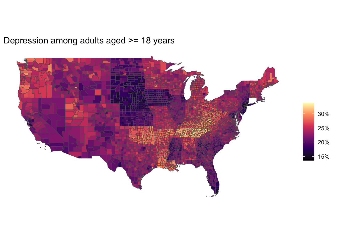
This map still has lots of work to do, but it’s exciting to be able to access and visualize data from the CDC so easily. In my next CDCPLACES:: post, I’ll focus on improved styling of maps like this.
In this post, I demonstrated how to fetch data from the CDCPLACES:: package and visualize and map the results, using the measure= or cat= arguments. In future posts, I’ll dig into more of the CDCPLACES:: package. There’s lots of interesting data available from this project. More soon!
Go to the CDC PLACES website for more details on the project and their methodology: https://www.cdc.gov/places/index.html↩︎
At the time of this review, Arkansas, Colorado, Connecticut, Illinois, Louisiana, New York, North Dakota, Oregon, Pennsylvania, South Dakota, and Virginia are not included in the social needs indicators in CDCPLACES.↩︎
Social Needs – a new category of data from the CDC PLACES project
The September 2024 release from CDC PLACES includes a new category of social needs measures, which include:
Instead of using the
measure=argument (as I did above), I’ll use thecat=argument to pull in all social needs indicators from the PLACES project.For this first release of social needs indicators, there are only 39 states included.2
I also like to visualize the error bands associated with point estimates. The
geom_errorborh()function comes in handy for that. I’ll visualize the top 25 food insecure counties, along with their confidence intervals.And I’ll visualize the food insecurity data from my home state, West Viriginia, where parts of central and southern West Virginia experience the highest rates of food insecurity in the state.