In Part One, I demonstrated how to fetch data and do some basic analysis of U.S. Census data. Each API call with the tidycensus:: package can only be for one year of data, so to do longitudinal analysis requires some additional wrangling. In this post, I’ll build a script that iterates through the available years, fetches the data, then combines the data into a single dataframe. Then, I’ll unpack some of the trends seen in child poverty in Colorado.
In Part Two, I showed how to fetch multiple years of data from the American Community Survey and create a single dataframe using purrr::map_df(). Then, I showed some different ways of visualizing the data, including margins of error, time series, and using Observable Plot.
In this post, I’d like to drill down further – to the Census tract level – to demonstrate how to fetch, wrangle, and visualize data using tidycensus::. I’ll also use some of the tigris:: package to enhance my geospatial plots.
Loading the scales:: package to transform ggplot scales simply (some people choose to explicitly define scales:: in their code rather than loading the library).
2
The janitor::clean_names() function tidies the column names of your dataset to use the snake case convention. Very handy!
3
The gt:: library provides functionality for creating ggplot-esque tables.
4
The first time that you’re working with the tidycensus:: package, you need to request an API key at https://api.census.gov/data/key_signup.html. The install= argument will install your personal key to the .Renviron file, and you won’t need to use the census_api_key() function again.
Data
As I did in the prior demos, I’ll use data from the American Community Survey (ACS). I’d like to analyze and map data related to children and health insurance coverage. Using the tidycensus::load_variables() function and searching on “health insurance” shows all variables that include that in the American Community Survey.
This search led me to table “B27001” (you can identify tables using the name column and all characters prior to the underscore). In the get_acs() function, I could use the table= argument instead of the variables= (but for this work, I’ve narrowed the data that I want to look at to variables for children with health insurance coverage).
A note on mapping with tidycensus::
In Part One, I used the usmap:: package to quickly map state and county-level data. This package is handy for a quick US map, but it does have limitations, including:
It doesn’t map using ggplot2, so it’s not as pretty or customizable than I like, and
It’s only built for US maps of states and counties (and in this post, I want to map smaller areas).
Fortunately, tidycensus:: is built for this, too! The get_decennial() and get_acs() functions have an argument for geometry=, which if set to TRUE, will return the polygons for your data along with the fields requested in the API call. Geographic options include: “state”, “county”, “block group”, “tract”, “block”, and “zcta” (zip code tabulation area).1
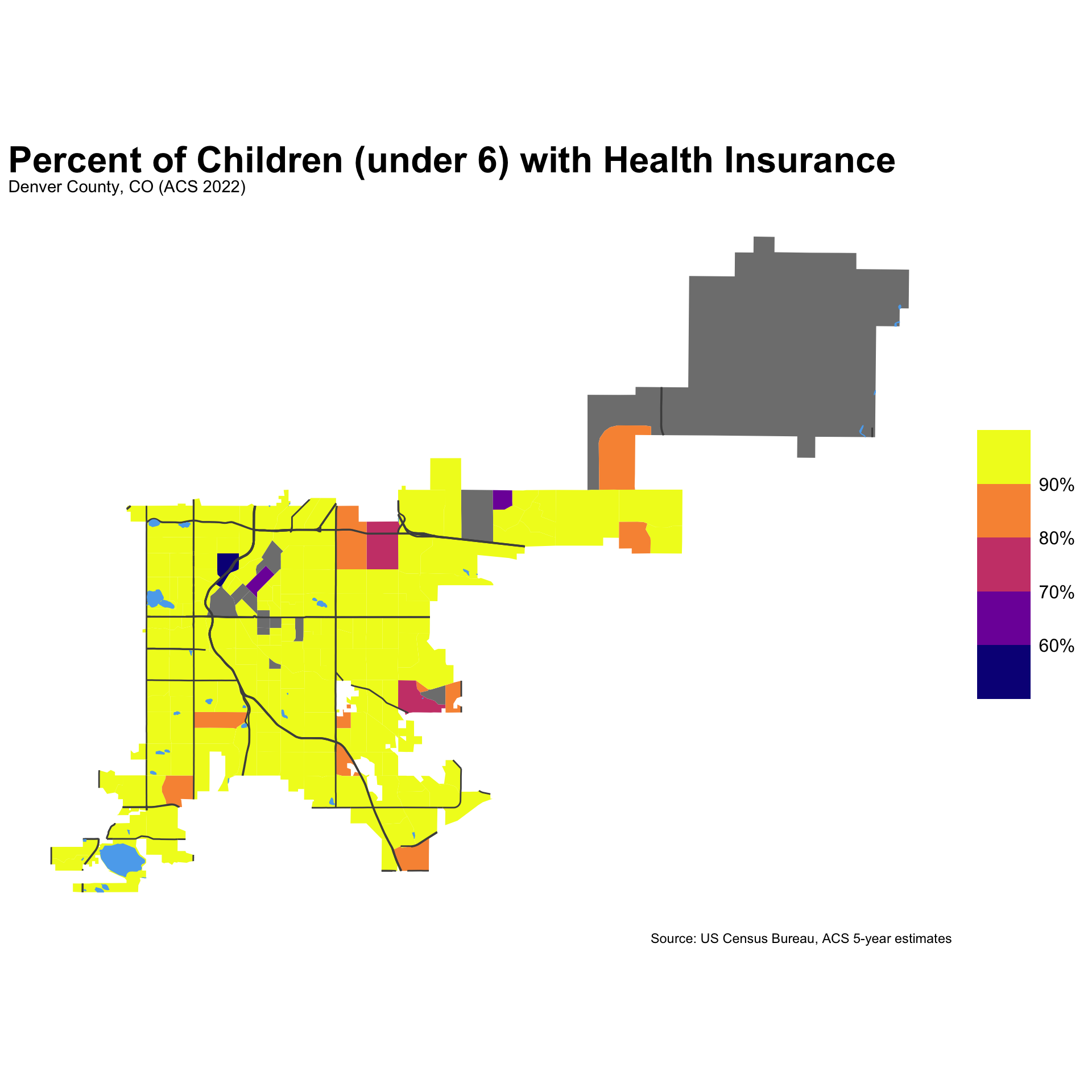
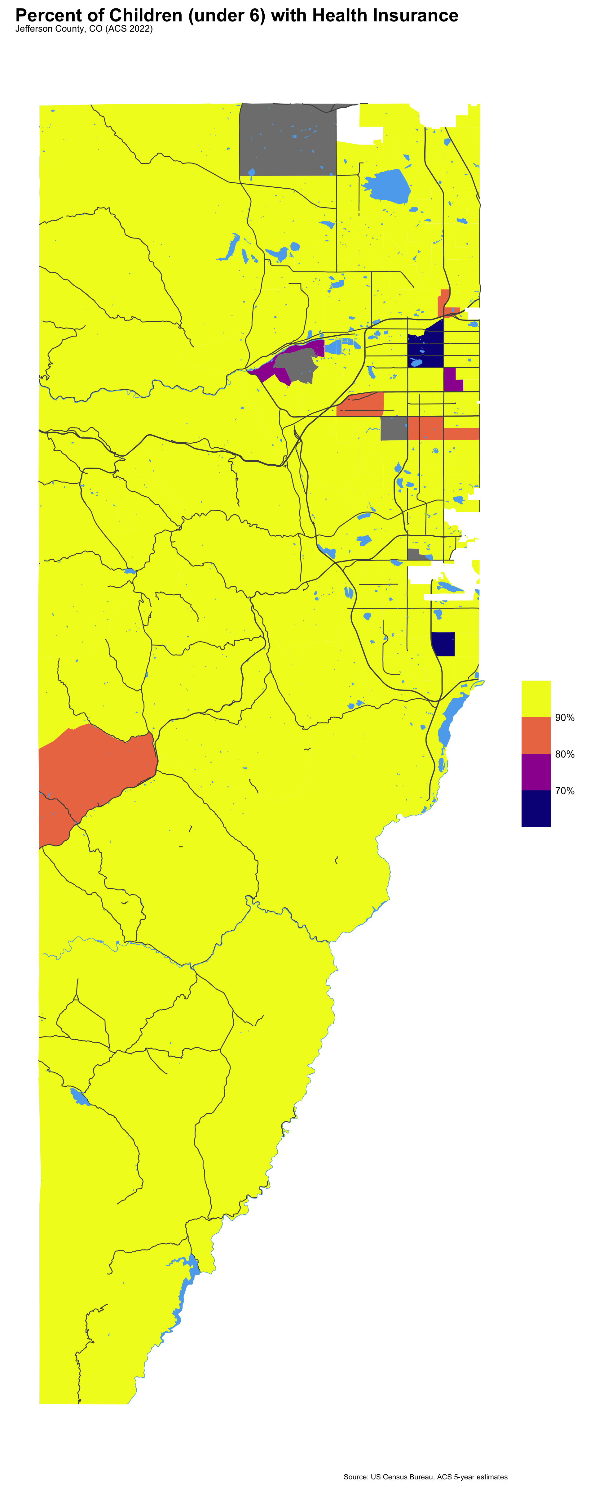
With the tigris:: package, you can download major map features, including roads and water areas, which make maps more immediately relatable. In this post, I’m exploring Census tract data, which is not a well known unit, so adding roads and water area helps orient readers to the map.
den_roads <-roads("CO", "Denver") %>%# this filter limits the roads to major streets onlyfilter(RTTYP %in%c("I", "S", "U", "C"))den_water <-area_water("CO", "Denver")jeff_roads <-roads("CO", "Jefferson") %>%filter(RTTYP %in%c("I", "S", "U", "C"))jeff_water <-area_water("CO", "Jefferson")
Mapping with ggplot and tigris::
When setting geometry=TRUE, tidycensus:: fetches the polygons for your set geography, along with the tables or variables requested. Then, using geom_sf() allows you to set the fill= argument within the aesthetic for whatever variable that you want to map.
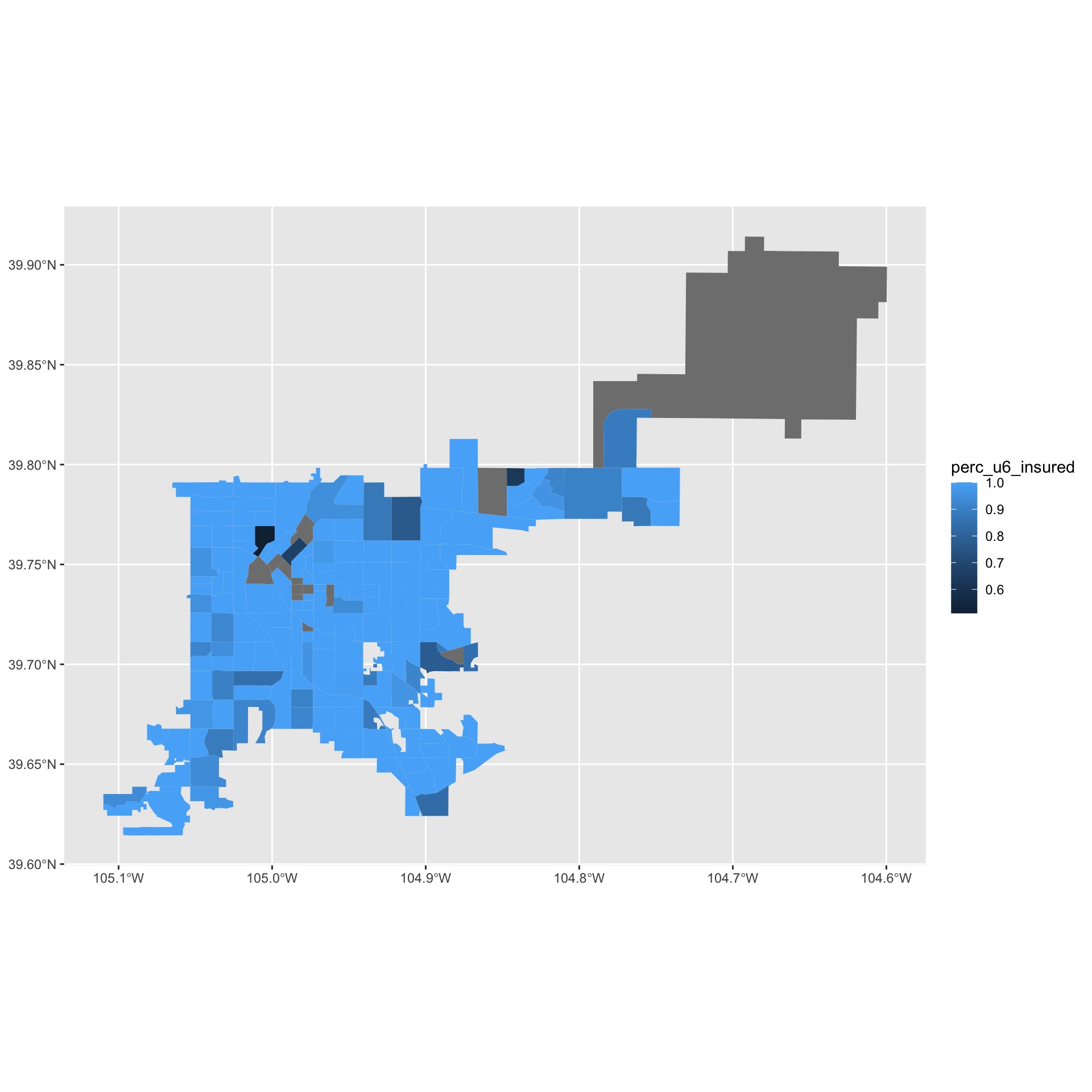
acs_data_tract %>%filter(str_detect(NAME, 'Denver County')) %>%ggplot(.) +geom_sf(aes(fill = perc_u6_insured), color =NA)
It’s that simple to get your first map rendered with Census data. Still, there’s plenty that we could do to make this map more effective:
The coordinates along the axis (as well as the grid) aren’t typically necessary for these kinds of maps.
The color palette can be challenging for some with visual impairments.
The map is lacking some features, such as major roads or water, that would make the map more relatable.
We need a title, cleaned up legend, and general tidiness.
acs_data_tract %>%filter(str_detect(NAME, 'Denver County')) %>%ggplot(.) +geom_sf(aes(fill = perc_u6_insured), color =NA) +# adds features of roads and waterwaysgeom_sf(data=den_roads,color="gray30") +geom_sf(data=den_water,color='steelblue2', fill='steelblue2') +# removes the grid from the vizcoord_sf(datum =NA) +# changes the palette to one that is more accessiblescale_fill_viridis_b(option ="plasma", labels = percent,n.breaks =5) +ggtitle("Percent of Children (under 6) with Health Insurance",subtitle ='Denver County, CO (ACS 2022)' ) +labs(caption ="Source: US Census Bureau, ACS 5-year estimates") +theme_minimal() +theme(plot.title = ggtext::element_textbox_simple(face="bold", size=24),legend.title =element_blank(),legend.key.size =unit(1.25, "cm"),legend.text =element_text(size =12))
Here’s another map of Jefferson County, CO! Knowing the county, it’s clear that between I-70 and I-76 that there is a pocket of the county that is lacking in health insurance for children.
acs_data_tract %>%filter(str_detect(NAME, 'Jefferson County')) %>%ggplot(.) +geom_sf(aes(fill = perc_u6_insured), color =NA) +geom_sf(data=jeff_roads,color="gray30") +geom_sf(data=jeff_water,color='steelblue2', fill='steelblue2') +# removes the grid from the vizcoord_sf(datum =NA) +scale_fill_viridis_b(option ="plasma", labels = percent,n.breaks =5) +ggtitle("Percent of Children (under 6) with Health Insurance",subtitle ='Jefferson County, CO (ACS 2022)' ) +labs(caption ="Source: US Census Bureau, ACS 5-year estimates") +theme_minimal() +theme(plot.title = ggtext::element_textbox_simple(face="bold", size=22),legend.title =element_blank(),legend.key.size =unit(1.25, "cm"),legend.text =element_text(size =12),plot.margin =margin(10, 10, 10, 10))
Conclusion
In this tidycensus:: post, I demonstrated:
How to access American Community Survey data for geographic units below the county level
How to fetch geospatial data straight from tidycensus:: for quick mapping of smaller spatial areas
How to add feautres, such as major roads and waterways, using the tigris:: package
More to come on poverty analysis in future posts!
Footnotes
Other geometries, such as school districts, can be accessed directly from the tigris:: package.↩︎