library(tidyverse)
library(sf)
library(maps)
library(ggsci)
library(patchwork)
First, I’ll read in the cluster analysis results from Part One.
kmeans_viz_data <- read_csv('.//data/kmeans_viz_data.csv')Get the country polygons from the sf:: package.
world1 <- sf::st_as_sf(map('world', plot = FALSE, fill = TRUE))Plot these polygons using ggplot().
ggplot() +
  geom_sf(data = world1) +
  coord_sf(xlim = c(-30, 60),
            ylim = c(39, -37))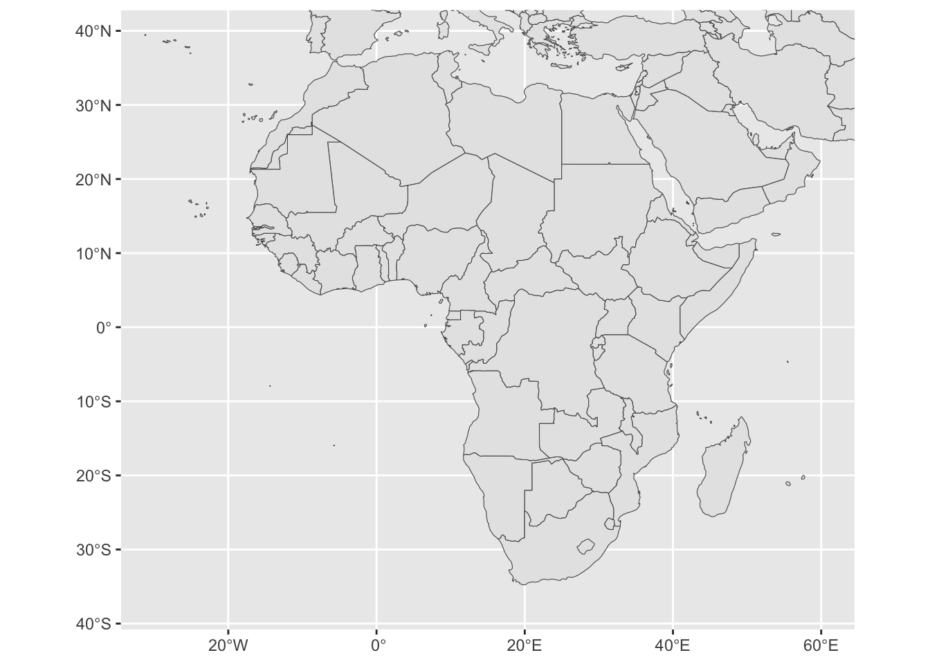
Create custom map themes.
map.theme <- theme(text = element_text(family = "Arial", color = "black"),
                   panel.background = element_rect(fill = "white"),
                   plot.background = element_rect(fill = "white"),
                   #panel.grid = element_blank(),
                   #panel.border = element_blank(),
                   plot.title = element_text(size = 25, hjust = 0),
                   plot.subtitle = element_text(size = 25),
                   plot.caption = element_text(size = 20),
                   axis.text = element_blank(),
                   axis.title = element_blank(),
                   axis.ticks = element_blank(),
                   legend.position = "inside",
                   legend.key.size = unit(.7, "cm"),
                   legend.direction = "horizontal",
                   legend.background = element_rect(fill="white"))

map.theme.small <- theme(text = element_text(family = "Arial", color = "black"),
                   panel.background = element_rect(fill = "white"),
                   plot.background = element_rect(fill = "white"),
                   panel.grid = element_blank(),
                   plot.title = element_text(size = 8, face = 'bold', hjust = 0.5),
                   plot.subtitle = element_text(size = 8),
                   axis.text = element_blank(),
                   axis.title = element_blank(),
                   axis.ticks = element_blank(),
                   legend.position = "none",
                   legend.background = element_rect(fill="white"),
                   legend.title = element_blank())
Mapping
Recode some country names to make sf:: and the cluster results compatible.
map.world <- map_data("world") %>%
  mutate(region = recode(region,
                         "Central African Republic" = "Central AfR",
                         'Democratic Republic of the Congo' = 'Congo, Democratic Republic of',
                         'Republic of Congo' = 'Congo, Republic of',
                         'Equatorial Guinea' = 'Equa Guinea',
                         'Guinea-Bissau' = 'GuineaBiss',
                         'Ivory Coast' = "Cote d'Ivoire",
                         'Sierra Leone' = 'SierraLeo',
                         'South Sudan' = 'Sudan South'))
Cluster maps
joined.world.map <- left_join(x=map.world,
                             y=kmeans_viz_data,
                             by=c('region' = 'country'))
Using the coordinates from above to focus on Africa, I’ll map the cluster results.
(l_map_clust <- joined.world.map %>%
  filter(africa == '1') %>%
  ggplot(.) +
  geom_polygon(aes(x = long, y = lat, group = group, fill = clust_name), color="gray90") +
  geom_polygon(data=. %>% filter(region == 'Western Sahara'),
               aes(x = long, y = lat, group = group), fill = "gray90", color="gray90") +
  coord_map(xlim = c(-30, 60),
            ylim = c(39, -37)) +
  labs(fill = '') +
  scale_fill_jco() +
  map.theme +
  guides(fill=guide_legend(nrow=2, byrow=TRUE)) +
  theme(legend.position.inside = c(.2, .3)))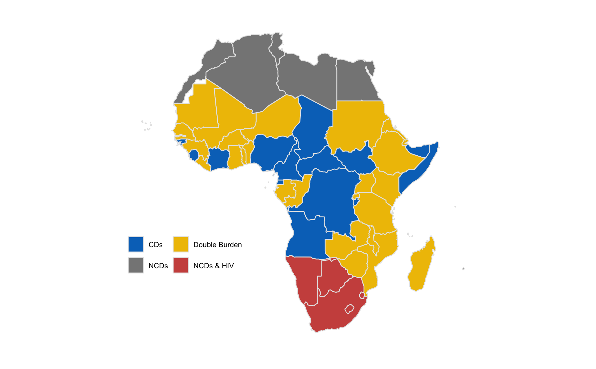
I want to plot each of the island nations alongside the continental map, so that you can see their results more clearly. I’ll generate a zoomed in map for each, and then use patchwork:: to bring them all together.
(s_map_1 <- joined.world.map %>%
  filter(africa == 1) %>%
  ggplot(.) +
  geom_polygon(aes(x = long, y = lat, group = group, fill = clust_name), color="gray90") +
  scale_fill_jco() +
  ggtitle('Cabo Verde') +
  coord_map(xlim = c(-25.5, -22.2), ylim = c(14.5, 17.8)) +
  map.theme.small)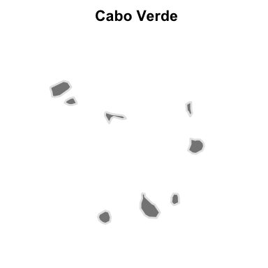
(s_map_2 <- joined.world.map %>%
  filter(africa == 1) %>%
  ggplot(.) +
  geom_polygon(aes(x = long, y = lat, group = group, fill = clust_name), color="gray90") +
  scale_fill_jco() +
  ggtitle('Comoros') +
  coord_map(xlim = c(42.1, 45.4), ylim = c(-13.4, -10.1)) +
  map.theme.small)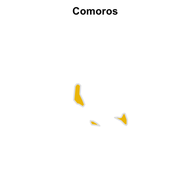
(s_map_3 <- joined.world.map %>%
  filter(africa == 1) %>%
  ggplot(.) +
  geom_polygon(aes(x = long, y = lat, group = group, fill = clust_name), color="gray90") +
  scale_fill_jco() +
  ggtitle('Mauritius') +
  coord_map(xlim = c(56, 59.3), ylim = c(-22.3, -19)) +
  map.theme.small)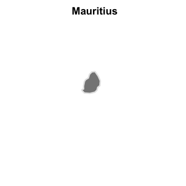
(s_map_4 <- joined.world.map %>%
  filter(africa == 1) %>%
  ggplot(.) +
  geom_polygon(aes(x = long, y = lat, group = group, fill = clust_name), color="gray90") +
  scale_fill_jco() +
  ggtitle('Sao Tome and Principe') +
  coord_map(xlim = c(5, 8.3), ylim = c(-.5, 2.8)) +
  map.theme.small)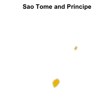
(s_map_5 <- joined.world.map %>%
  filter(africa == 1) %>%
  ggplot(.) +
  geom_polygon(aes(x = long, y = lat, group = group, fill = clust_name), color="gray90") +
  scale_fill_jco() +
  ggtitle('Seychelles') +
  coord_map(xlim = c(55.2, 55.8), ylim = c(-4.9, -4.4)) +
  map.theme.small)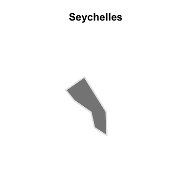
(s_map_plot_grid <- s_map_1 / s_map_2 / s_map_3 / s_map_4 / s_map_5)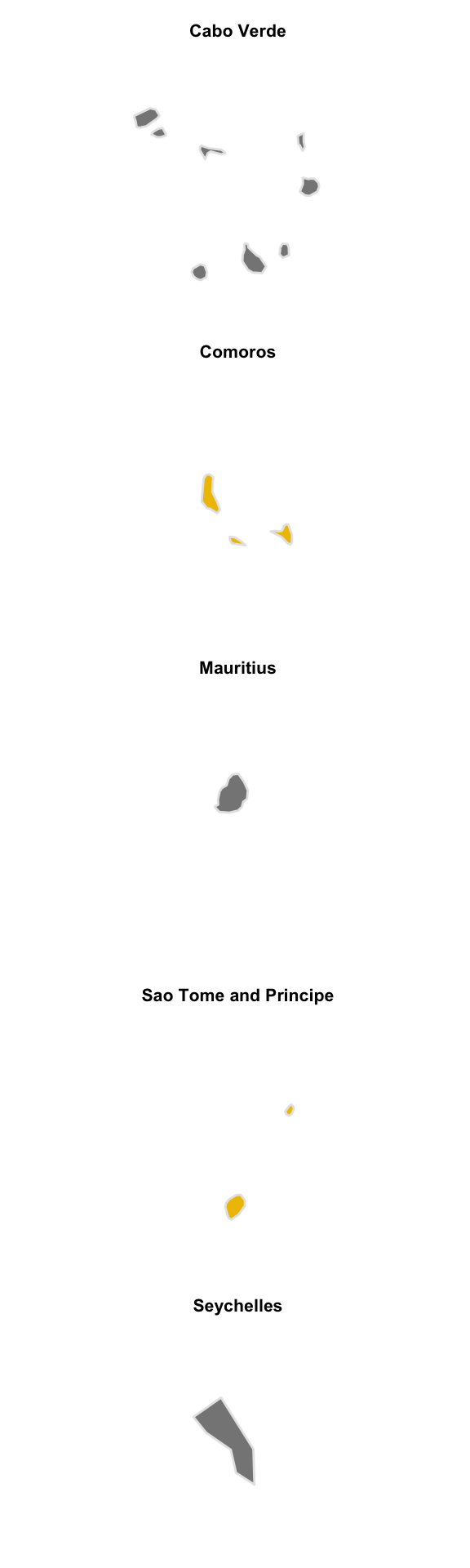
Now, the final plot that brings them all together.
(l_map_clust + s_map_plot_grid + plot_layout(widths = c(8, 1, 1)))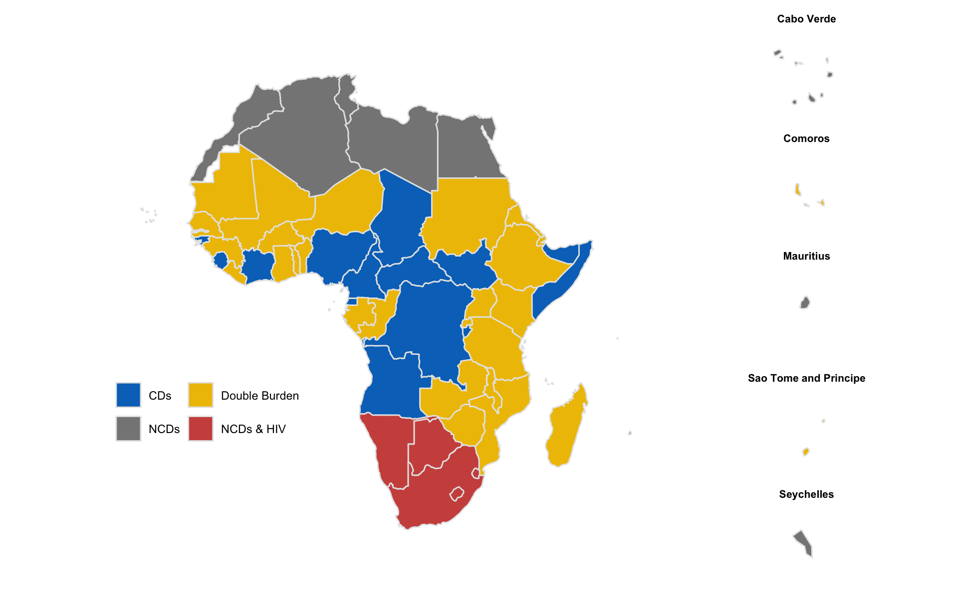
These results demonstrate that, while there are some discernible regional patterns in health outcomes, some countries in West, Central, and East Africa do not necessarily look like their neighbors.