        country        continent        year         lifeExp
 Afghanistan:  12   Africa  :624   Min.   :1952   Min.   :23.60
 Albania    :  12   Americas:300   1st Qu.:1966   1st Qu.:48.20
 Algeria    :  12   Asia    :396   Median :1980   Median :60.71
 Angola     :  12   Europe  :360   Mean   :1980   Mean   :59.47
 Argentina  :  12   Oceania : 24   3rd Qu.:1993   3rd Qu.:70.85
 Australia  :  12                  Max.   :2007   Max.   :82.60
 (Other)    :1632
      pop              gdpPercap
 Min.   :6.001e+04   Min.   :   241.2
 1st Qu.:2.794e+06   1st Qu.:  1202.1
 Median :7.024e+06   Median :  3531.8
 Mean   :2.960e+07   Mean   :  7215.3
 3rd Qu.:1.959e+07   3rd Qu.:  9325.5
 Max.   :1.319e+09   Max.   :113523.1
Introduction
Purpose
In this project, I wanted to experiment with gganimate:: to reproduce the classic animated visualization by Hans Rosling of Gapminder data.
Dataset
The Gapminder dataset, compiled by the Gapminder Foundation, provides data on global development trends, including indicators like life expectancy, GDP per capita, and population. The dataset is known for its use in dynamic visualizations that illustrate changes in global indicators over time.
Setup
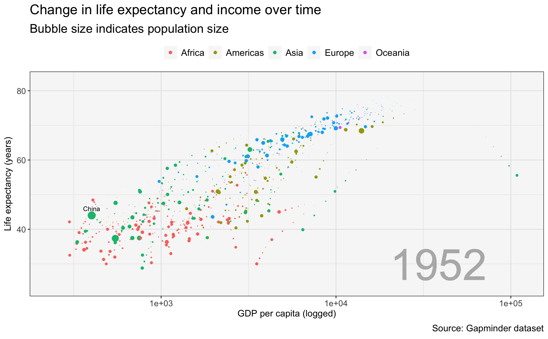
In this graphic, I want to spotlight China’s development path, and also show the story of differences by continent. First, I’ll show all the data, which makes clear the need for animation of this data.
gapminder %>%
  ggplot(.,
         aes(x=gdpPercap,
             y=lifeExp,
             size=pop,
             color=continent)) +
  geom_point() +
  geom_text(data=gapminder %>% filter(country == 'China'),
                           aes(label=country),
                           family='Arial', size= 3, color='black', nudge_y = 2) +
  scale_x_log10() +
  ggtitle('Change in life expectancy and income over time',
          subtitle = 'Bubble size indicates population size') +
  labs(x='GDP per capita (logged)\n',
       y='Life expectancy (years)',
       caption='Source: Gapminder dataset') +
  theme(legend.position = 'top',
        legend.title = element_blank()) +
  guides(size='none')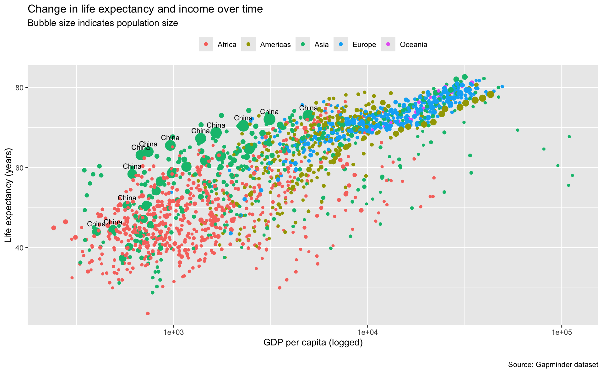
gganimate::
gapminder %>%
  ggplot(.,
         aes(x=gdpPercap,
             y=lifeExp,
             size=pop,
             color=continent)) +
  geom_point() +
  geom_text(data=gapminder %>% filter(country == 'China'),
                           aes(label=country),
                           family='Arial', size= 3, color='black', nudge_y = 2) +
  geom_text(aes(x=min(gdpPercap),
                y=min(lifeExp),
                label=as.factor(year)),
            hjust=-3.5, vjust=-0.2, alpha=0.2, color='gray70', size=20) +
  scale_x_log10() +
  ggtitle('Change in life expectancy and income over time',
          subtitle = 'Bubble size indicates population size') +
  labs(x='GDP per capita (logged)\n',
       y='Life expectancy (years)',
       caption='Source: Gapminder dataset') +
  theme(legend.position = 'top') +
  guides(size='none') +
  my.theme +
  transition_states(
    year,
    transition_length = 2,
    state_length = 0,
    wrap = TRUE
  ) +
  enter_fade() +
  exit_shrink() +
  ease_aes()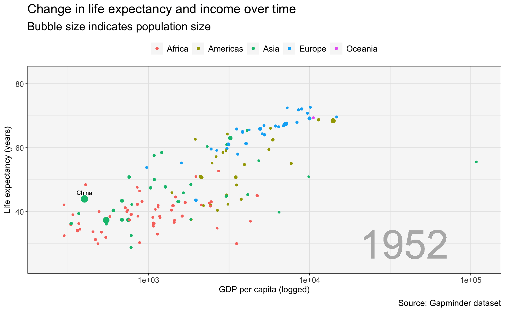
Using the gganimate::shadow_wake() function to leave a trail
gapminder %>%
  ggplot(.,
         aes(x=gdpPercap,
             y=lifeExp,
             size=pop,
             color=continent)) +
  geom_point() +
  geom_text(data=gapminder %>% filter(country == 'China'),
                           aes(label=country),
                           family='Arial', size= 3, color='black', nudge_y = 2) +
  geom_text(aes(x=min(gdpPercap),
                y=min(lifeExp),
                label=as.factor(year)),
            hjust=-3.5, vjust=-0.2, alpha=0.2, color='gray70', size=20) +
  scale_x_log10() +
  ggtitle('Change in life expectancy and income over time',
          subtitle = 'Bubble size indicates population size') +
  labs(x='GDP per capita (logged)\n',
       y='Life expectancy (years)',
       caption='Source: Gapminder dataset') +
  theme(legend.position = 'top') +
  guides(size='none') +
  my.theme +
  transition_states(
    year,
    transition_length = 2,
    state_length = 0,
    wrap = TRUE
  ) +
  shadow_wake(wake_length = 0.1, alpha = FALSE, exclude_layer = c(2,3)) +
  enter_fade() +
  exit_shrink() +
  ease_aes()